Monday, January 23, 2006

HT postage stamp campaign!


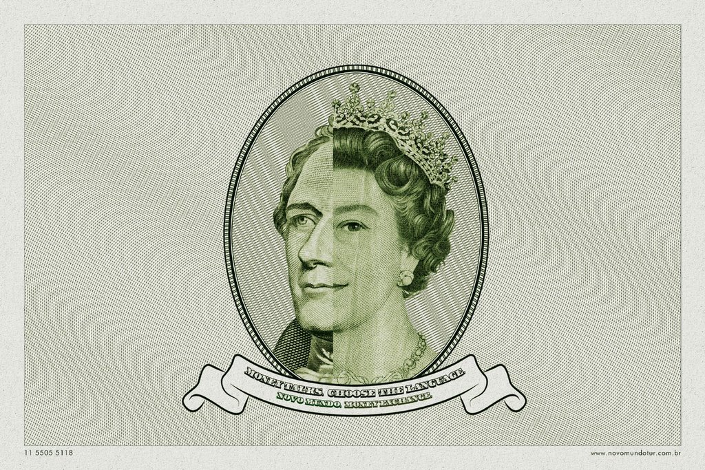
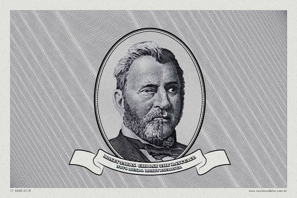
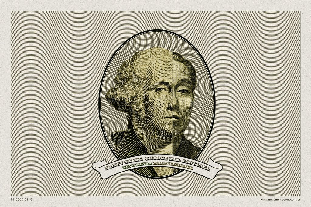
I love the art and the idea but I just can't seem to believe that it's the best thing a team with so much talent could have come up with. But then, I'm sure that there's more behind every campiagn than what meets the eye! For all you know this could be the fiftieth campaign that the client finally approved after several rounds of presentation. advertising...its about the attitude to go on and on and on!
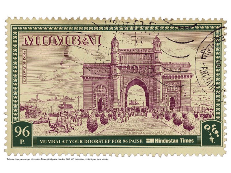
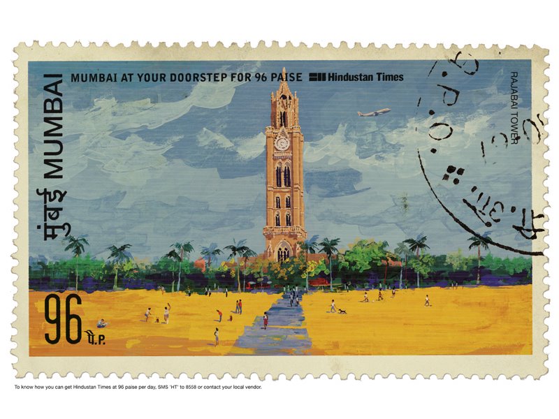
Headline: To know how you can get Hindustan Times at 96 paise per day, SMS 'HT' to 8558 or contact your local vendor.

Credits:
Agency: Ogilvy, Mumbai
Creative Director: Piyush Pandey, Abhijit Avasthi.
Art Director: Ashish Naik, Siddhartha Datta.
Copywriter: Manoj Shetty.

Rastogi's from be positive 24!

Me & my partner came up with this creative that was published a few days ago. It was done for a store that sells curtains and home furnishing in Chennai. I don't think the art is as great as we would have liked it to be but I guess the idea is still there. any feedabck from all you lovely critics out there? would you have done this ad any differently? I'd love to know!

Rejoice!


Superb effort from Leo Burnett, Bangkok. Extremely effective and tells me the message so intrestingly. Amazing!! Done by Sumak Chaudhary, an art director from Leo Burnett. The aim was "to innovatively highlight Rejoice Conditioners as the solution for tangled hair, this ambient piece was placed amongst the many utility cables strewn throughout Bangkok’s Central Business District." Great stuff.

bad teeth??


Club 18-30!


OK, I know that this is an old campaign, but I had to put it up coz' I love the art direction so much. I can imagine the amount of photoshop that has gone into a campaign like this. Amazing. For those of you who don't know Club 18-30 is a getaway for adults.

a copy of a copy of a copy of a copy of a copy of a copy!


Ha Ha! Nice & smart little creative this. Straight to the point. Anybody knows the agency that did this ad?

De Beers Diamond Festival


It takes a great sense of dedication to your craft to come out with such work time and time again. The whole strategy of "selling diamonds to a man", that's an idea that desrves a hat-tip. Pure and absolute genius!

Saturday, January 21, 2006

B A N A N A S ! !

Found this simply stunning piece of packaging online. I think it cuts across almost every language in the world and works across nations and conveys the message every single time. All attributes of work that is hard to come by more often. Whoever did this, you're amazing at your job. Keep rocking!

Press Play from Phillips


Can somebody confirm if this campaign is one that's made from fingerprints entirely. I think it is coz' that's the only way I could link the headline that reads "Press play." Is there a bigger idea too? I'm confused!

Rimmel 100% Waterproof Markers


yet again, all 3 visuals looking the same? anybody agree that this should have been a one-off ad? Seen one, seen them all!

WWF MGM Combo.

Is this a one-off or a campaign? I think it's a campaign. No idea which agency too. But nice idea.

Money makes the world go around!!


I get the idea but do any of you find the execution a little flawed? Coz' I did! I just thought that the merging of the faces had to be more distinct and that it still appears to be a little forced in the manner in which this campaign has been executed. Any more views?

Ikea Fabric Beauty.


Ikea did this guerilla display somewhere in Brazil. I think it's a superb idea to demonstrate the power of the product. Absolutely stunning work.

Nasal Hair Remover....Damn!

Found this weird ad for a Nasal Hair Remover on Adverblog.com today. This ad struck me like a bolt. Is this a scam ad or a scam product? I never have used one of those things and never knew one such thing existed, pretty strange, what do you think??

Twisted & Turned On a Bike Ride!


This campaign for Extreme Bike, Munich was done by an agency called Start in Munich. It's got some amazing art direction but I really dont get the idea and the fact that it has such a twisted headline too. One of my creative directors once advised me that an ad should never have a twisted headline along with a twisted visual. That way the reader gets none of it. This is probably the best example of that.

Slim From Sagem


Great campaign. No denying that at all. One look and everybody knows the product benefit but then, I still have a problem with the fact that all 3 ads in the campaign look like one. Does one need 3 ads or should it have been a one-off? What's your take on the whole thing?

Saturday, January 14, 2006

Durex Passion!


I have always believed that the greatest way to do an ad is to talk to the customer without telling him I am an ad. That whole point of talking to him when he's least expected to be spoken to. That kind of response is simply more memorable than advertising of any other kind. This Guerilla Camapign from McCann Erickson for Durex does exactly that. Can we have more stuff like this please!