


Product: Museum Exhibit / Services
Client: typemuseum.org
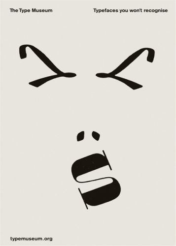
Headline: Typefaces you won't recognise
Agency: Abbot Mead Vickers BBDO
Country: London, U.K.
Continuing with the discussion on art directors, I love the fact that art direction has so many facets to it. Think of the innumerable number of factors like photography, typography, colour, illustration, design, layouts, fonts and several other thingst that one can play with to create magic out of a simple idea that originates from somewhere and ends up looking like something else altogether. This campaign for the type museum is a something that uses type interestingly...nice stuff!


1 comment:
I've always found good use of typography interesting (and too rare). These are incredible.
Post a Comment