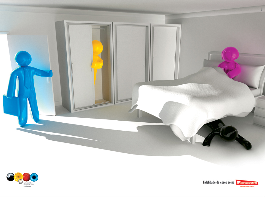
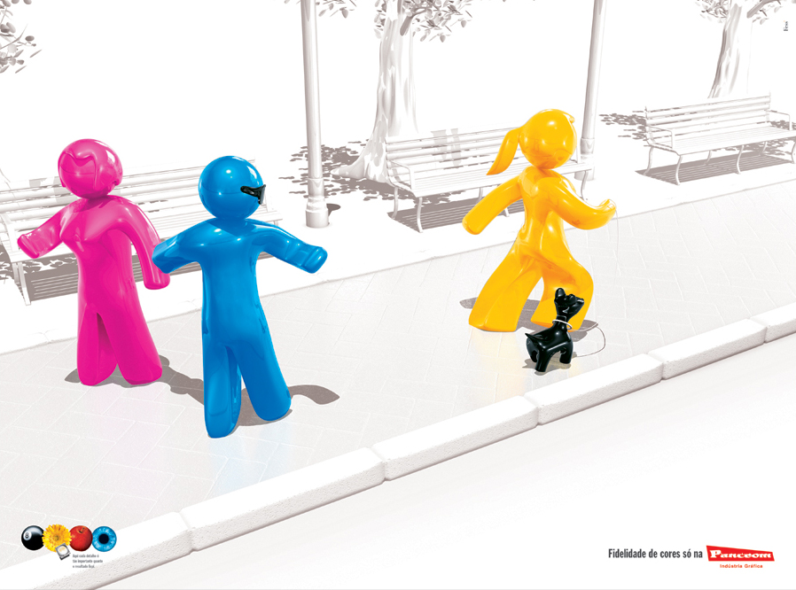
 A campaign for Pancrom - A digital studio in Brazil that deals with Pre-press, Printing, Re-touching, Color Correction, Finishing, Color Correction, etc. It would be great if somebody could translate the headline here. For more details go here! A campaign for Pancrom - A digital studio in Brazil that deals with Pre-press, Printing, Re-touching, Color Correction, Finishing, Color Correction, etc. It would be great if somebody could translate the headline here. For more details go here!


7 comments:
I think it means "Color fidelity only at Pancrom". It matches the visual pretty well :)
It has something to do with Faithfulness. I reckon is the faithfulness of color.
I love the prints and on this occasion I'm telling you: keep on doing the great job that you do by having this cool advertising blog!.
Thank you, you have been an inspiration. Almost like the Luerzer ;)
Good luck!
Angelica - Bucharest.
Andrea is right. Her translation is correct.
here's an interesting thought...Andrea is a guy.
THank you for enlighting us, Andrea!
Yeah, we can see the CMYK (4 colours of offset printing) in their real world. The visualization is amazing and execution too...Hatts off!!!
S. Nagesh (Art) / Dentsu Marcom / Mumbai
Ooops, sorry. In Brazil, "Andrea" is a girl's name.
Ooops, sorry. In Brazil, the name "Andrea" is usually used for girls.
Post a Comment