Monday, January 23, 2006
The Madhubani Collection from W


This campaign for a women's fashion brand named "W" was done by Rediffusion DY&R in Delhi, India. I like the waythe art relates to local culture and remains ethnically relevant too. The ad depicts a working woman through her busy day in the Madhubani style of cloth weaving and the ad is also for the same collection of work wear for women.
SF (san frisco) Tee Shirt Festival



Edgy Art Direction from Fish Eye Creative in Bangalore, India. This campaign for a t-shirt festival are done in the style of calendar and poster art of various Hindu Gods and Godesses. The models replace the gods in various styles and the art is extremely cult. I think it stands out and makes a statement individually. Nice work!
The Brand New Logo Saga!
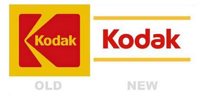




It looks like it is the season of logos and brand identities. Recently across the globe Intel unveiled its new swish logo as it is being popularly called after trashing the pretty famous Intel Inside Logo.
And Kodak also dumped its traditonal logo and has opted for a no frills nor anything to say logo. In both cases, I like the older Intel and the older Kodak. The leap ahead as a baseline seems like yet another of those convoluted baselines that tech firms seem to come up with time and time again.
Closer home, LML today unveiled its new logo and brand identity. The logo was designed by Vyas Gianetti Communications in Mumbai. Indian Airlines also went in for a revamp and is now called "Indian". The logo was inspired from the Ashoka Chakra. I don't really have too much to compalin and I think its a decent effort from the brand to move ahed and raise its overall image in this era of growing competiton from every other airline service.
But the logo that seems to have made the loudest noise all over seems to be the pink from hutch. I have heard mixed reactions to this one.
Some of them calling for a end the pug that has been overused and has eventually lost its charm and some others for the use of an unconventional colour like Pink. Maybe Hutch should have tried the color pink in Japan. Pink is considered a colour of Machoism there!
My take on the Hutch Pink is the fact that it will work well for Hutchison. It cuts clutter, questions conventions, is attractive and hard to miss and also makes a statement without looking cheap or tacky. Anybody think anything more??
Guerilla Bowling


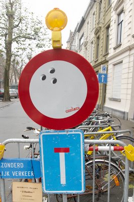

Thanks to Matthias Dubois from Duval Guillaume Brussels for sending in this Guerilla Campaign for a bowling alley. Here are a few words about the campaign in his own words:
As of last month, bowling has significantly increased in Ghent. Cause of this is the new guerilla campaign created by Duval Guillaume Brussels. The campaign aimed for the area around the “Overpoort Bowl”, a popular bowling alley right in the hart of the Ghent’s student neighbourhood.
All kinds of round objects in the scenery were provided with 3 little round black stickers, representing holes. The effect of this is that all of the sudden any round object were transformed into a bowling ball. Bike helmets, watermelons, traffic signs, … All round objects around the bowling alley got a “bowling ball make-over”.
Even indoors, students were subtly tempted to go bowling more often: in several pubs in the neighborhood, the well known toilet sign was replaced with a sign in which the icon held its head as a bowling ball.
Client: Overpoort Bowl
Advertising manager: Lucien De Vos
Agency: Duval Guillaume Brussels
Creative director: Katrien Bottez, Peter Ampe
Art director: Geert De Rocker
Copywriter: Tom Berth
Graphism: Lim Sijmons
Studio: Mark Gillioen
Production: Willy Hebbrecht
Account: Matthias Dubois
Media: Guerilla
Studio: Mark Gillioen
Production: Willy Hebbrecht
Account: Matthias Dubois
Media: Guerilla
HT postage stamp campaign!
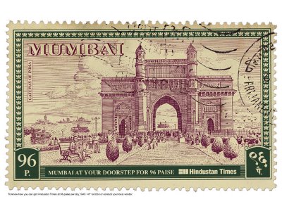
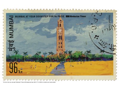
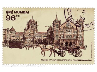
I love the art and the idea but I just can't seem to believe that it's the best thing a team with so much talent could have come up with. But then, I'm sure that there's more behind every campiagn than what meets the eye! For all you know this could be the fiftieth campaign that the client finally approved after several rounds of presentation. advertising...its about the attitude to go on and on and on!
Headline: To know how you can get Hindustan Times at 96 paise per day, SMS 'HT' to 8558 or contact your local vendor.
Credits:
Agency: Ogilvy, Mumbai
Creative Director: Piyush Pandey, Abhijit Avasthi.
Art Director: Ashish Naik, Siddhartha Datta.
Copywriter: Manoj Shetty.
Rastogi's from be positive 24!
 Me & my partner came up with this creative that was published a few days ago. It was done for a store that sells curtains and home furnishing in Chennai. I don't think the art is as great as we would have liked it to be but I guess the idea is still there. any feedabck from all you lovely critics out there? would you have done this ad any differently? I'd love to know!
Rejoice!

Superb effort from Leo Burnett, Bangkok. Extremely effective and tells me the message so intrestingly. Amazing!! Done by Sumak Chaudhary, an art director from Leo Burnett. The aim was "to innovatively highlight Rejoice Conditioners as the solution for tangled hair, this ambient piece was placed amongst the many utility cables strewn throughout Bangkok’s Central Business District." Great stuff.
Saturday, January 21, 2006
Subscribe to:
Comments (Atom)
