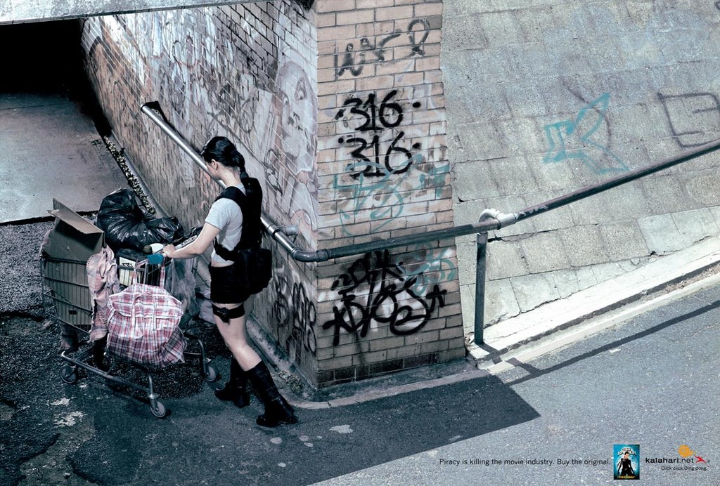
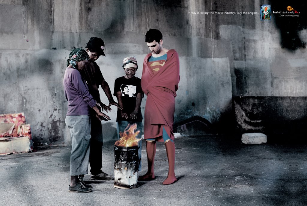
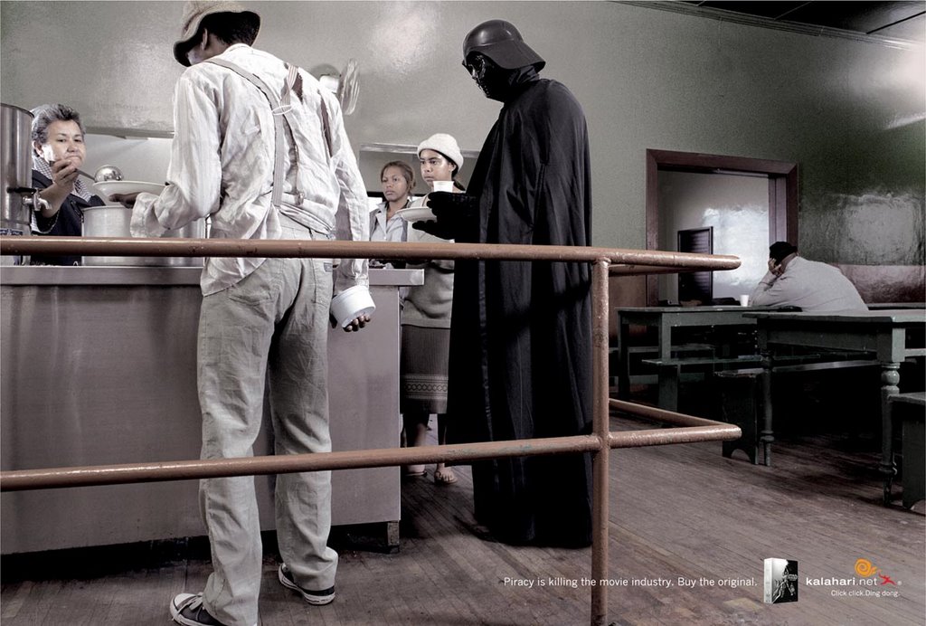
 Agency: FCB, Cape Town, South Africa >> Creative Director: Francois de Villiers >> Art Director: Schalk van der Merwe >> Copywriter: Schalk van der Merwe / Dylan Kidson >> Photographer: Guy Nevelling >> via Agency: FCB, Cape Town, South Africa >> Creative Director: Francois de Villiers >> Art Director: Schalk van der Merwe >> Copywriter: Schalk van der Merwe / Dylan Kidson >> Photographer: Guy Nevelling >> via
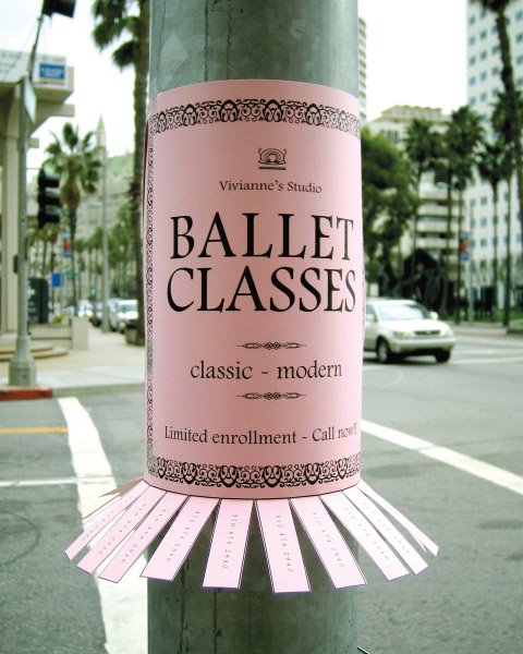 This one is pretty similar to the Piano Classes Guerilla Idea posted a few days ago. I can think of another 5. Let's see what else comes up here! via
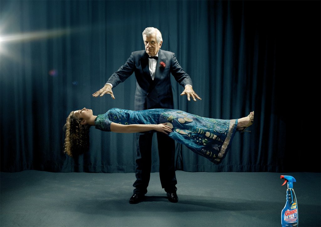 WOW! This print ad from JWT, Milan for Glassex Window Cleaner is really really cool. I like it for 2 reasons other than the idea itself...it gives me a break from all those ads that show me birds and insects and dragons and demons and people either falling or hurting themselves after walking into transparent glass...seen a billion of those! And secondly the whole deal of just an image and the product...so bloody simple that anybody and everybody loves the idea. Terrific! VIA

 I can't even think of a campaign like this getting released in a country like mine! The deal here is that alcoholic beverages generally use slim, sexy and svelte figures for their ads so Nova Schin decided to use pregnant ones for their Non-Alcoholic Beer! Anybody knows the agency, comment!
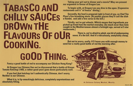
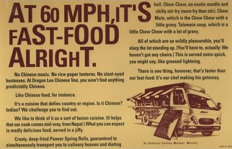

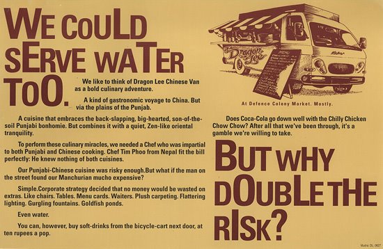
 Freddy Birdy & Naved Akhtar created this campaign when they were at Mudra several years ago. The duo now have their own advertising agency called 'The Shop' in New Delhi. This campaign won a lot of awards at several fests and is also featured in the Indian Copy Book.

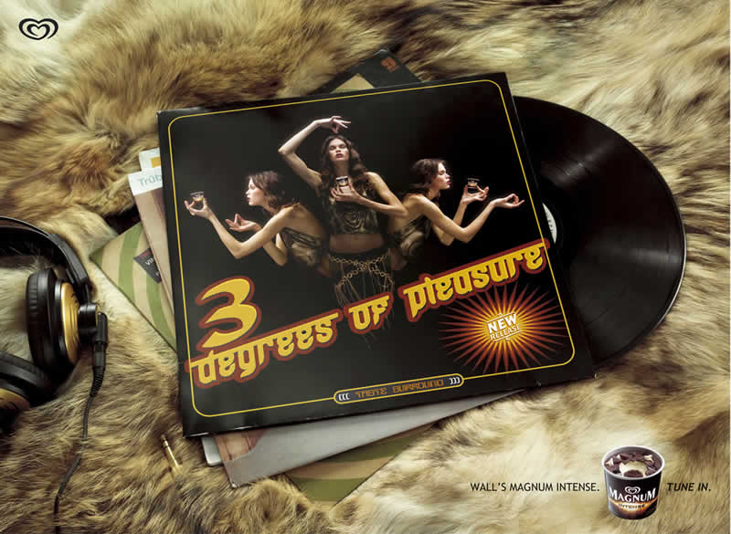

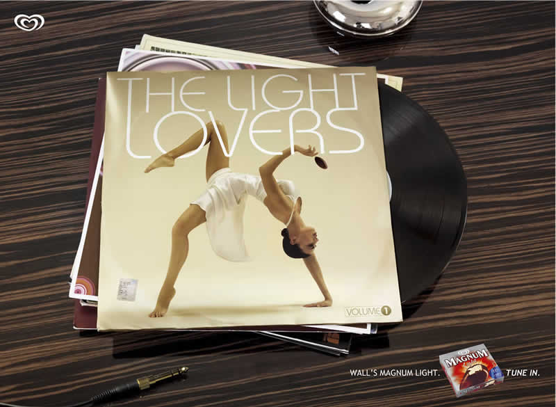
 A 6 ad campaign that won at Epica 2004. I love the treatment of using CD Covers to showcase something like an Ice Cream, it makes me interested in knowing more!
A campaign that won at Epica 2004 a few years ago. It's an idea that has been repeated several times ever since. I saw something similar this morning too. If you know the agency that did this, leave a comment.
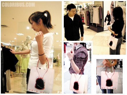 Yet another shopping bag idea!! These were created to encourage people to donate blood. The headline on the bag reads 'Saving a life is as easy as going shopping.' The words “give blood” in Mandarin are slang for “going shopping” via


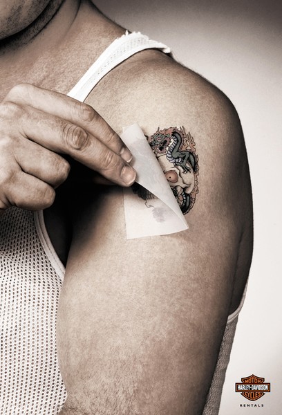 I was running through the Cannes Archives and found both these ads amongst the Winners in the Press and Outdoor Category. The first ad for Harley Davidson Test Drives was done by Loducca Publicidade Ltd in São Paulo. While the second ad that has almost exactly the same idea was done by Ogilvy and Mather South Africa in Johannesburg. Kinda weird, isn't it?
 A rewind to the Cannes Lions in 2004 where Ogilvy & Mather was one of the four Bronze Lion Winners from India in the Press & Outdoor Category for this Public Service campaign done for Hutch. The Public Service Ads were aimed at discouraging people from using their cell phones while driving.
 Agency : Saatchi & Saatchi >> Location: London >> Executive Creative Director : Kate Stanners >> Copywriter : Matt Skolar >> Art Director : Philippe Fass
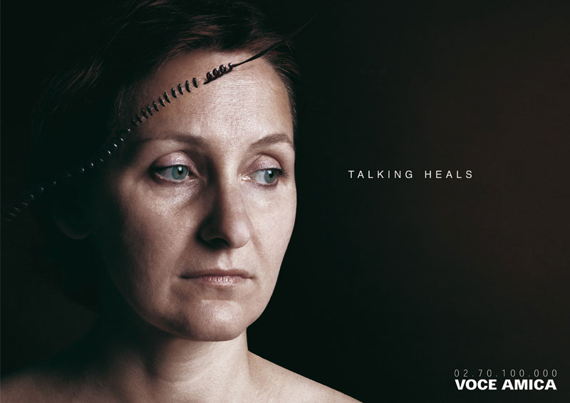
 Voce Amica or Voice Friend is an Italian Helpline.

 I really think these ads for Welt Kompakt, a newspaper from Germany really rock! A brilliant idea that is well executed, to perfection one could say. It's going to be a long time before I could get them out of my senses! Unfortunately I don't know the agency that did these...if you do, please leave a comment.
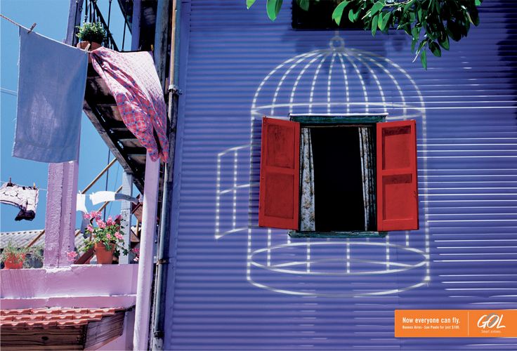
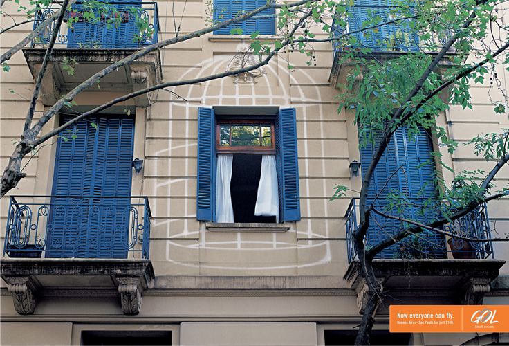 This one reminded me of Air Deccan, an Indian Airline because they have more or less the same positioning. But I don't know if GOL is really the common man's airline with a tagline that's similar!
 Another campaign for Faber Castell that was sent in by Michael Rudnicki. I like this one better. It has a stronger idea and is more effective in conveying how good these pencils actually are.