 Thanks to Matthias Dubois from Duval Guillaume Brussels for sending in this Guerilla Campaign for a bowling alley. Here are a few words about the campaign in his own words:
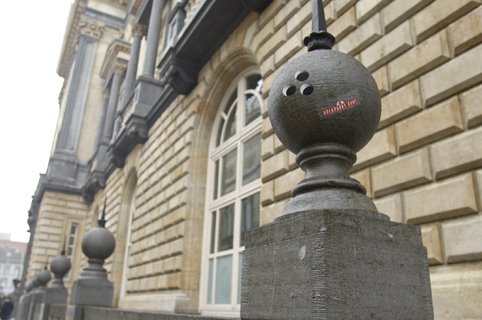
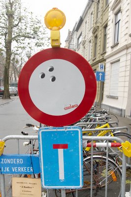
As of last month, bowling has significantly increased in Ghent. Cause of this is the new guerilla campaign created by Duval Guillaume Brussels. The campaign aimed for the area around the “Overpoort Bowl”, a popular bowling alley right in the hart of the Ghent’s student neighbourhood.
All kinds of round objects in the scenery were provided with 3 little round black stickers, representing holes. The effect of this is that all of the sudden any round object were transformed into a bowling ball. Bike helmets, watermelons, traffic signs, … All round objects around the bowling alley got a “bowling ball make-over”.
Even indoors, students were subtly tempted to go bowling more often: in several pubs in the neighborhood, the well known toilet sign was replaced with a sign in which the icon held its head as a bowling ball.
Client: Overpoort Bowl
Advertising manager: Lucien De Vos
Agency: Duval Guillaume Brussels
Creative director: Katrien Bottez, Peter Ampe
Art director: Geert De Rocker
Copywriter: Tom Berth
Graphism: Lim Sijmons
Studio: Mark Gillioen
Production: Willy Hebbrecht
Account: Matthias Dubois
Media: Guerilla


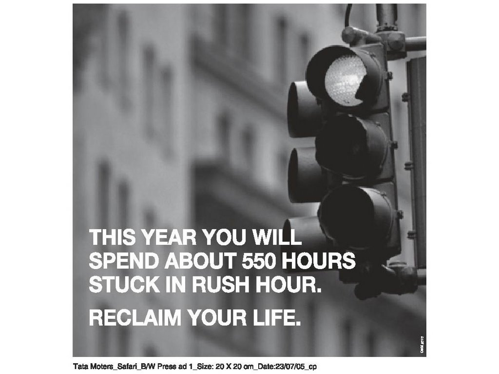
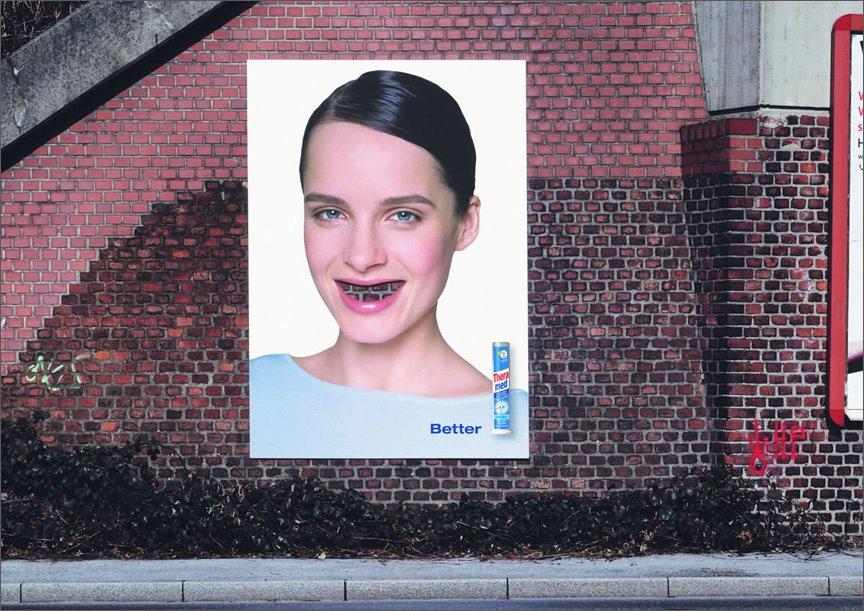
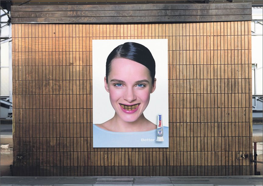
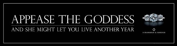
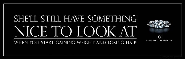
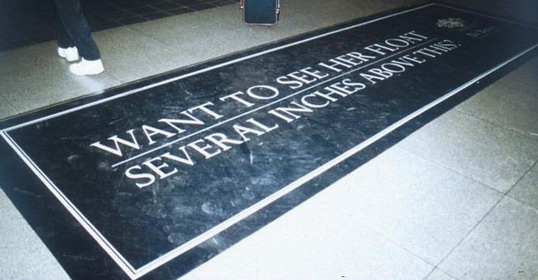
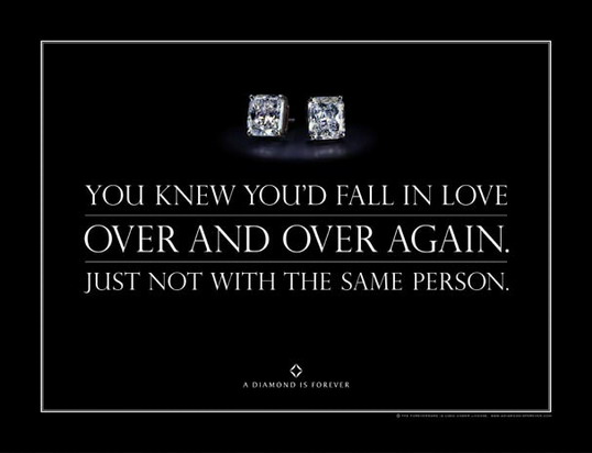
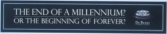
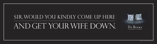
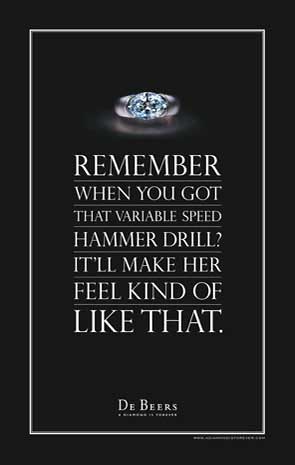
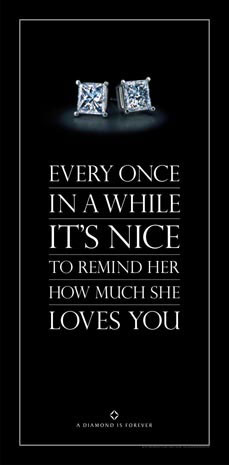
 Well, put your hands together! these guys have done it again. I clearly remember the first time I saw the TVC on the boob-tube, i had goosebumps. Somehow, the print does not evoke the same response from me.