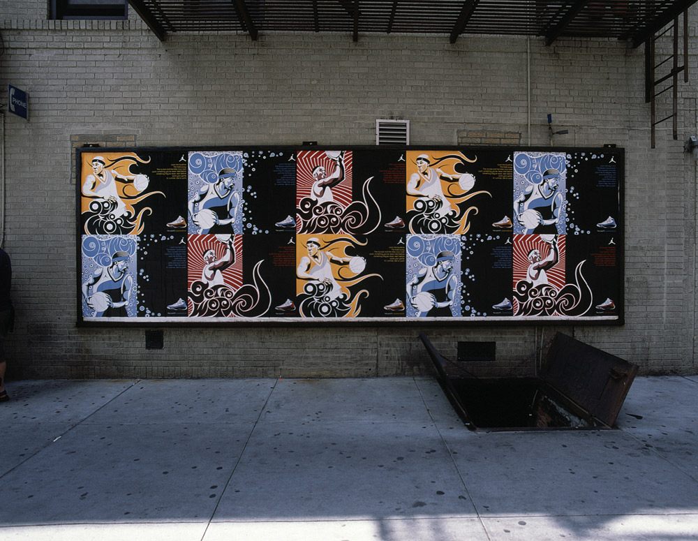
 Absolute proof that advertising is simply one of the craziest professions on the planet! Thanks to the team that created this. You make me happy to be here. This is really crazy yet superb work. via: coloribusAbsolute proof that advertising is simply one of the craziest professions on the planet! Thanks to the team that created this. You make me happy to be here. This is really crazy yet superb work. via: coloribus
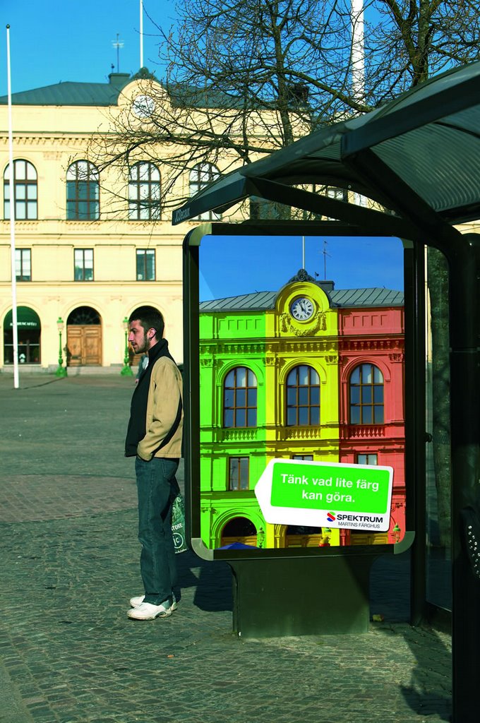
 A very clever campaign for a brand of paint called Spectrum from Germany (I Guess)! The copy reads "Imagine" or something to that effect (can anybody confirm or re-translate)
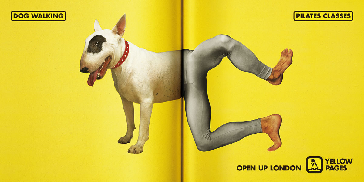
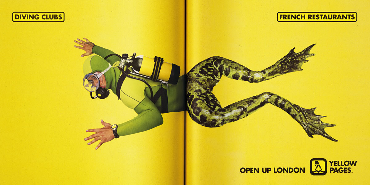 A weird campaign for The London Yellow Pages by Abbot Mead Vickers BBDO. What it does is convey the message immediately...
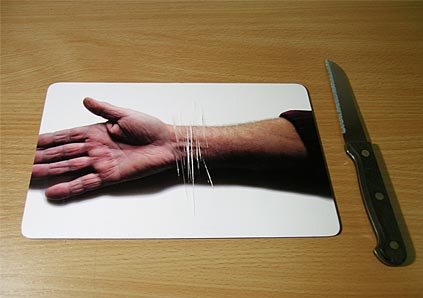
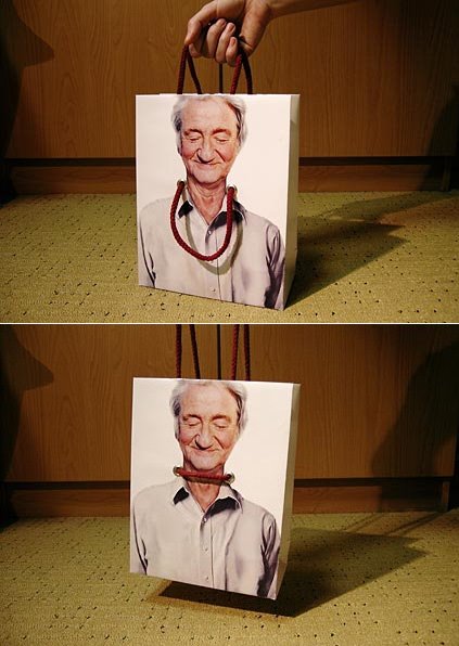 I dug out a few classics from my collection, a bag and a mousepad that work towards the same cause...prevention of suicide! I unfortunately don't know who did these and what they were done for but they are really cool! If anybody does, please comment.
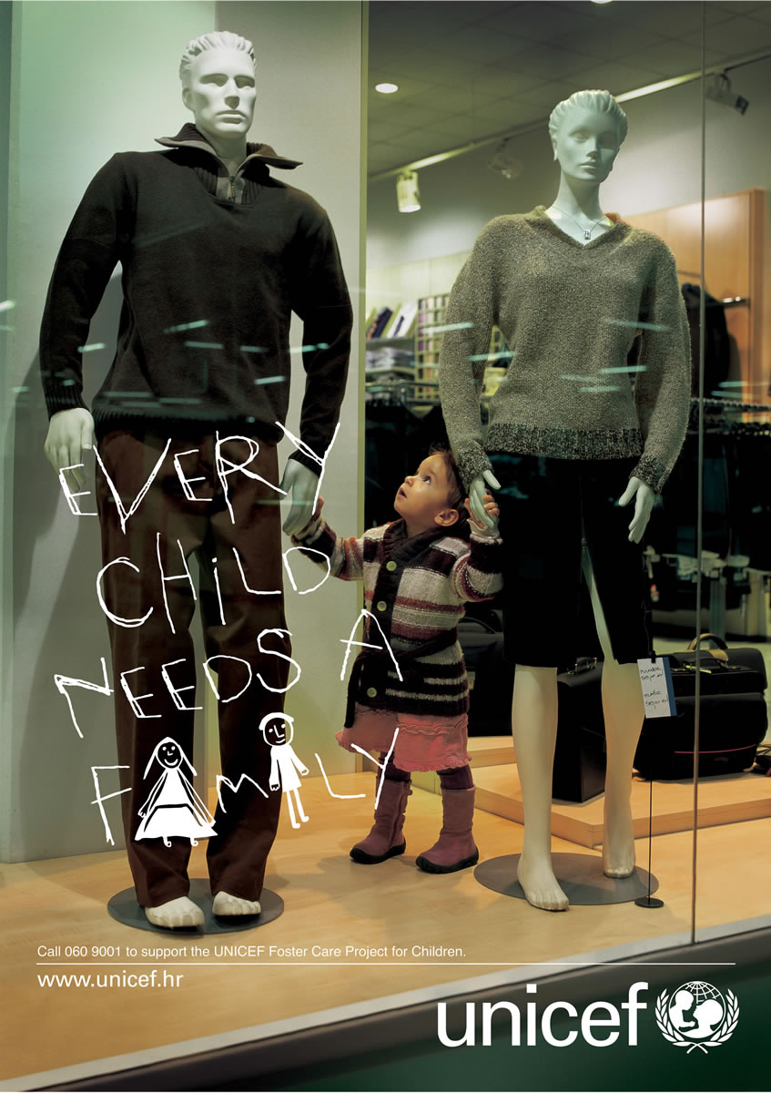 There are some creatives that are so brilliant that they just leave you speechless. This one by Lowe Dgital in Croatia talks to you straight from the heart.
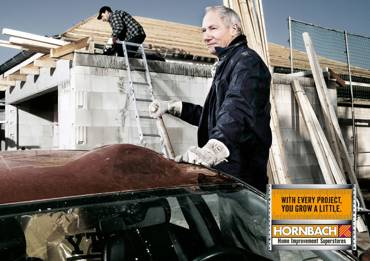

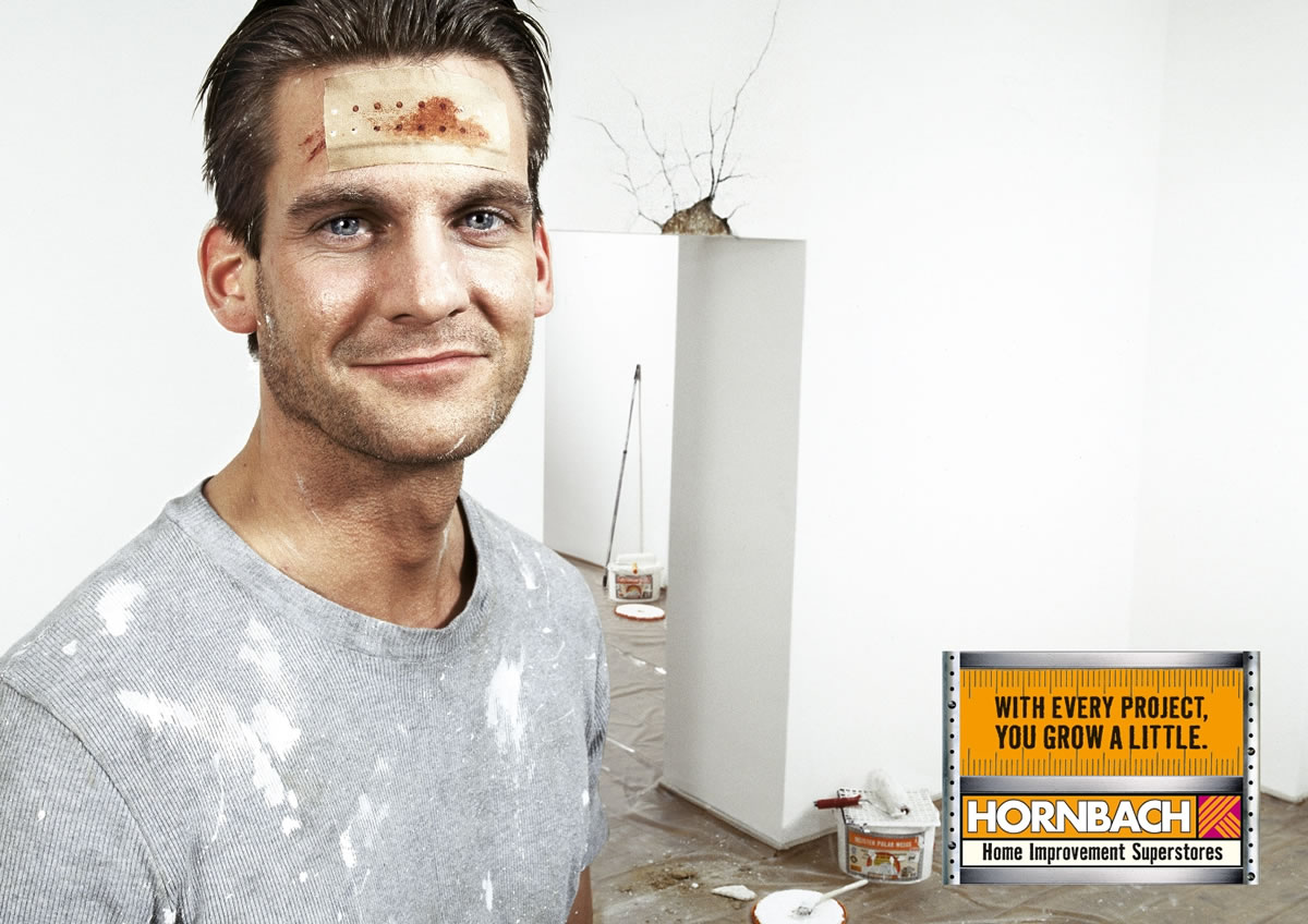
I understand the bump on the car, the crack on the door frame and the bench but what I don't is how home improvement stores help me grow?? Is it due to the knowledge of learning something new?? This campaign by Heimat in Berlin, Germany is kind of convoluted for me...anybody with a new viewpoint?
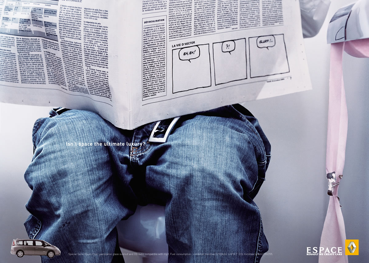

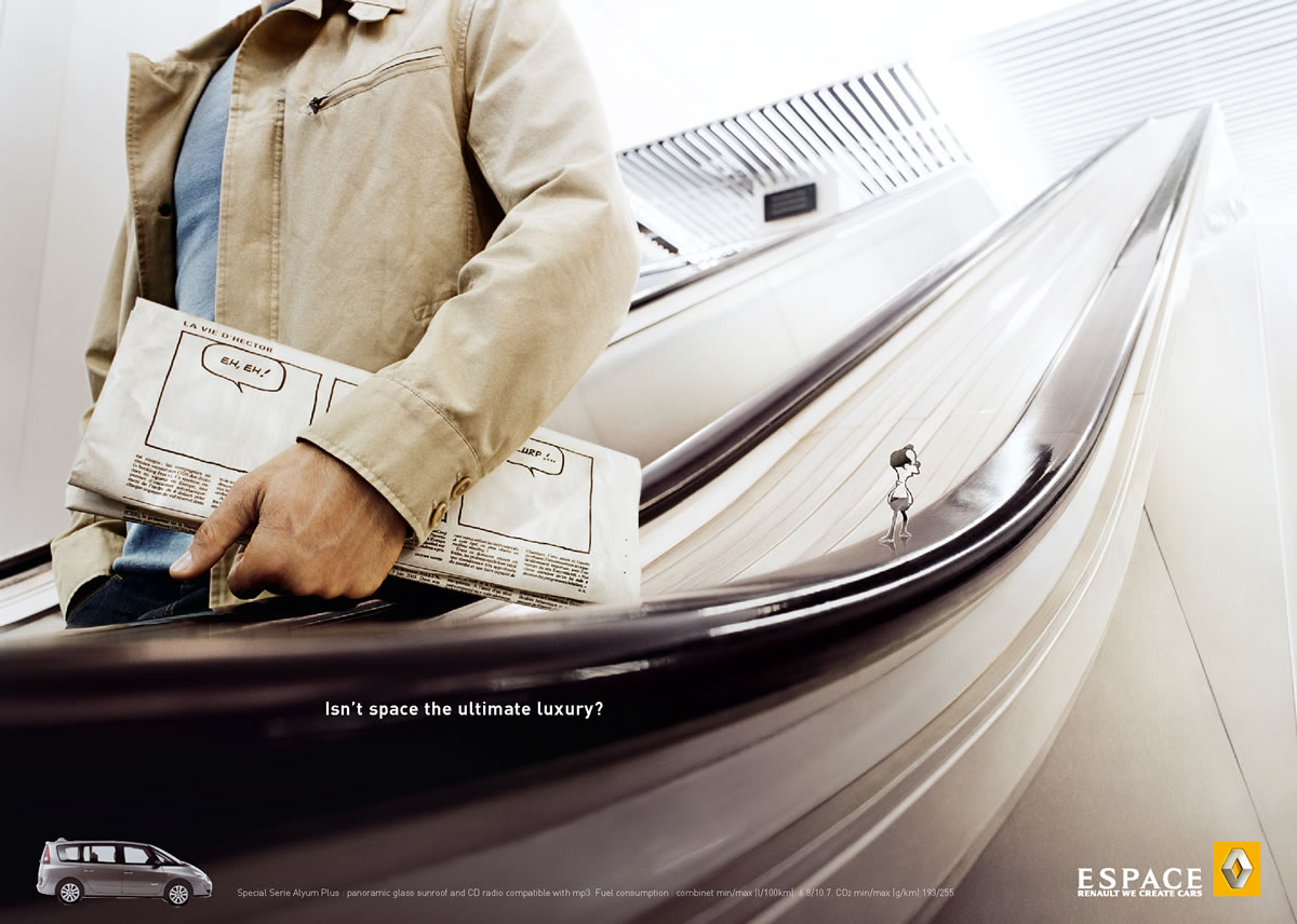
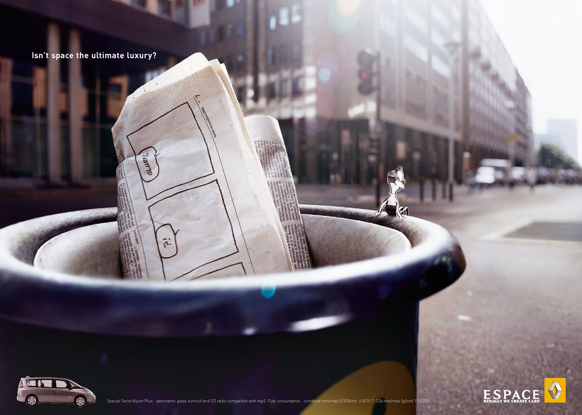
 The French Agency, Publicis Conseil created this campaign to depict the concept of space in the Renault. It's very refreshing from all the other space campaigns i've seen. Quite cool, not a surprise when it did win a Bronze Epica in 2005.
.jpg)
.jpg)
.jpg)
.jpg) A campaign for Beckers. A brand of paints from Sweden. The campaign was done by Akestam. Holst and won a Bronze Epica in 2005. It reminds me of one of those spot the difference puzzles we used to play as kids! An interesting way of showing how a little color can change your life!
A campaign for Beckers. A brand of paints from Sweden. The campaign was done by Akestam. Holst and won a Bronze Epica in 2005. It reminds me of one of those spot the difference puzzles we used to play as kids! An interesting way of showing how a little color can change your life!


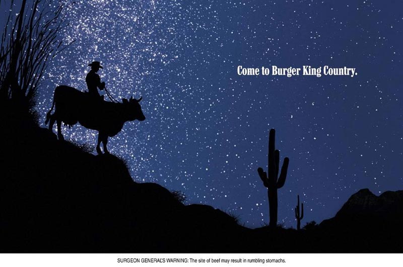 Start GMBH from an agency from Germany created this campaign for Malboro....errr, well for Burger King! My only query is why would anyone try to rip off a cigarette company's advertising or even imitate it?? Aren't they like the most harmful things on the planet (not that junk food is!) But all said and done, I think Burger King is on a faulty track here...wonder what they are trying to achieve?? via: coloribus

 I don't know the agency that did this but i think it's qute cool. A demonstration ad where you see the benefit of the product even before you walk into the store! My only worry is that it does not tell me anything new...all vacuum cleaners have to clean, they are made for that very purpose.
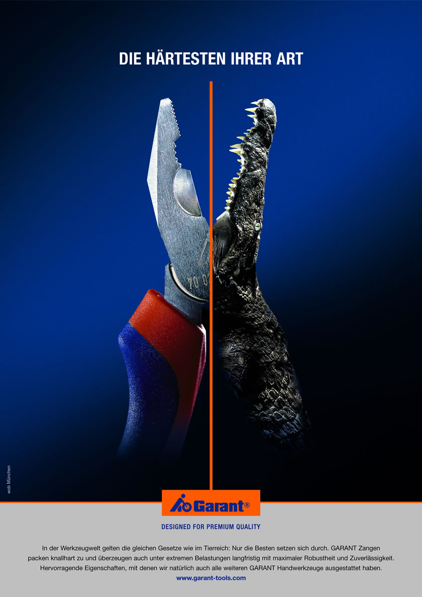
 This print campaign for a tool manufacturing company named Garant was done by a German Agency named WOB. The campaign features great photoshop skills and an equally nice idea. The campaign is also a Bronze winner at Epica 2005.

 An Epica Bronze winner from 180 Amsterdam in the Netherlands. Somehow, it's not as powerful as I would have liked it to be...