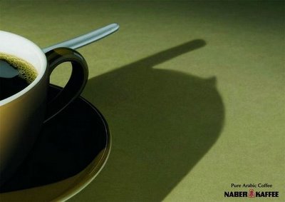
FCB Austria is the agency behind this ad for Naber Kafee. It took me about 2 minutes to get the idea behind this ad but something tells me most people would take longer (If I am not entirely underestimating the creative thought process of the average reader) and some might not get it at all. Do you get it? (PS: look @ the shadow carefully!)


11 comments:
It looks like a mosque dome and minrate?!
So, one of my friends who was trained in semiotics looked at it and told me in less than 5 seconds flat that it was a Mosque - but I could see a cellphone, someone asking to pee and numero uno, but even after he told me, I still don't think it's a mosque simply because that's too vague, and even if it as mosque, it's a broken down one without a minaret. And another thing is that I saw the Arabic coffee and thought of the Coffea arabica plant which is grown in Africa and South America; Arabic coffee is as Arabic as native Americans are Indians. So while it might make some vague sense, I think it's a bad ad. Then again, what do I know! =)
Hmm... I didn't get it, and even now that I know what it's supposed to be, I don't really see it. I think this one is a little too subtle to actually work. Seems like the creative got a little too married to a concept that was too hard to execute.
i thought it was a cellphone although the bump on the right seemed superfluous.
the shadow shows a a mosque. it "communicates" with the slogan "arabic flavour" - i guess :o) it took me 30 secs,
the first thng i got wat the tip of the tit...with a very thin lever of man,,,(cudnt resolve..)but thn i thot it must b sthng else...thn i thot of mosque...but yess with one minaret missing
watevr...pramil cudnt get it
Let's be honest the first look makes it look like a "tit".
but then with the base line a mosque is something which fits in.
they cud have used sand for inspiration. sand. dunes. a bloody camel.
i got it right away, the coffee cup is well placed on the side, so that your attention can focus on the middle of the page. and just one look at the logo - got it.
it's nice but not a fresh idea, have seen it for several products, even beer.
i get what it tries to say, but the ad came out vague, therefore failed at its attemp.
yet it has stimulated discussion into what the product is, often the brand has been mentioned, causing not only increased awareness but also classical conditioning, i saw a tit which made me [male minded] explore further, at which you discover it as a kind of Arabian castle [much like the ones from Aladins Lamp?
Post a Comment