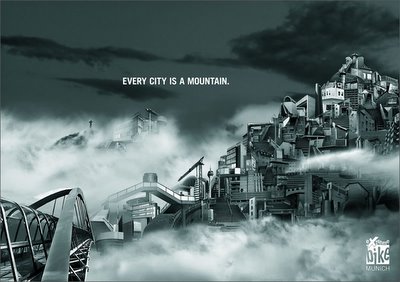

 This campaign for Extreme Bike, Munich was done by an agency called Start in Munich. It's got some amazing art direction but I really dont get the idea and the fact that it has such a twisted headline too. One of my creative directors once advised me that an ad should never have a twisted headline along with a twisted visual. That way the reader gets none of it. This is probably the best example of that.

2 comments:
DUDE... PUT UP THE LINKS WHERE YOU GOT YOUR ADS!
The links are right at the bottom. Scroll down and check out the url's provided ;) yeah! that's it.
Post a Comment