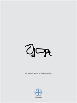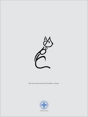

I generally like most of the work from 1pointsize and am of the general opinion that chennai gets most of its best creative campaigns from there. This campaign for the Blue Cross of India left me a little dissapointed. I get the fact that being creative and delivering a certain message in an interesting manner makes a big difference in the way the message is recieved, But what if the message is completely lost in acheiving the creative aspect of the ad?
I showed this campaign to almost 15 people and barely 2 of them got what the typography was trying to tell them. Maybe it's the execution or the idea itself but I just don't seem to think that this is a great campaign. Especially because it is not a niche product where it is OK if only a few people get the idea. It's adoption and that is an extremely generic sector of people you are talking to. Anybody thinks otherwise, shout it loud! :)


3 comments:
hey! abt dis ad...well, it went straight to my heart...yeah it dus stop u for a moment n make u tilt ur head in weird angles but once u do dat u immediately get de pic dat its a lil doggy n a very pretty cat n bang! adopt. mayb u gotta b a crazy animal lover to go 'damn! i want to now...' but if it's abt de time it takes (a wee bit longer than wid uthr ads)I guess u got a point. sure there's loads mo one can do, but dis did make its point to me...at least.
A thin line separates the Brilliant mix of creativity & clarity and something like this where you feel it fell short. U can't be very sure, u take a shot.
Arcane. I don't think the problem is in seeing the animals. That I understood right away. It is the word that makes up the animals that is hard to read. I agree that they lost too much of the word “Adopt” in this ad. I don't think a majority of people would be able to see the word. Especially in the cat ad.
Post a Comment