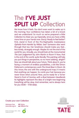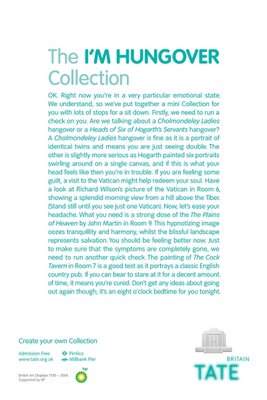


This campaign for Tate Britain was the Grand Prix winner at Cannes '06. One look at the other winners and you'll probably realise the loads of other work that could have won! I think it is mostly about sensibilities. If an international jury from across the world chose this then may be there is something that many of us wouldn't understand. Atleast I didn't get this campaign! Can anybody explain??
Category: Corporate Image >> Title: HUNGOVER >> Advertiser: TATE BRITAIN >> Product or Service: MUSEUM >> Advertising Agency: FALLON LONDON >> Country: UNITED KINGDOM >> Creative Director: Richard Flintham >> Copywriter: Juan Cabral >> Art Director: Juan Cabral >> Typographer: Ginny Carrel >>


3 comments:
It's abt the "collection" if you read it carefully, it directs you the paintings in the museum that will suit yr mood.. an interesting way to maneuver people in and around the museum and to get in different kinds of ppl to visit..
i liked the ads very much..
as i can see my friend u dont get most of the ads, are u really into advertising ?
As I can see Mr. Or Ms. Anonymous, your mom n dad, didn't give u a name and neither a brain! I guess ur one of those freak accidents...asshole. Don't like this blog, I've got 2 words "FUCK OFF"! I hope you understand that loud and clear...dumb bastard!
Post a Comment