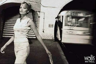
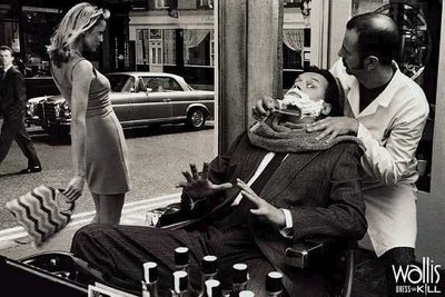
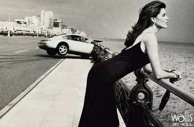
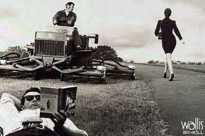
 A few days ago, Fabian Tritsch sent me the Wallis Campaign above asking me who had done it. The campaign was done by an agency named Bartle Bogle Hegarthy many years ago and the campaign was a huge success story because it broke the mould of regular fashion adverts where all you got to see was great looking images of a model wearing the merchandise and a prominent logo next to it.
I also found an interesting semiotic analysis of this campaign by Sarah Richards that you may want to read here
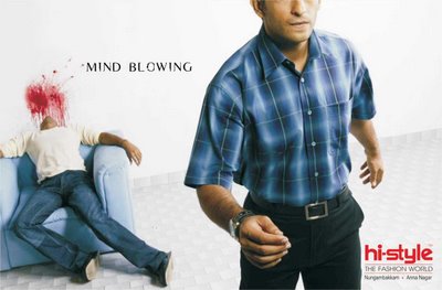
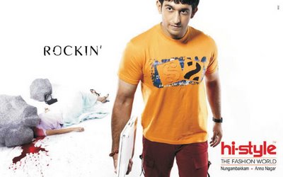
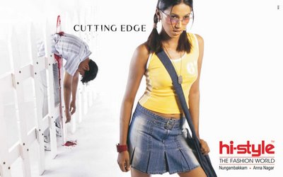

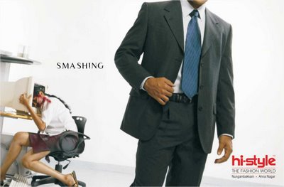 And many years later the wheel has evolved and come almost full circle, my partner Abhishek D Shah came up with this campaign for a store named hi-style in Chennai almost 2 years ago when he worked at an agency named Winds of Change (WOC). The campaign had to be pulled down after several protests from the public. I'd love to know whatyou think about it!


10 comments:
OBVIOUSLY
Yeah! This campaign reminds me of the movie "American Psyco". How did someone aproved it??
another good exemple for joelapompe.net or coloribus ...
I do not buy into the premise that hi-style "kills." The advert is needlessly gruesome.
poorly executed and inconsistent. it tries to play the shock factor only without much taste nor tact. font sizes for captions differ. people are dead yes, but why?
well guys, it's a clothing store...the clothes are so mind-blowing, smashing, drop dead gorgeous, etc are the literal reactions from people on seeing people wear the clothing, hope you see that!!! it's not mindless unjustified gore
It is not good, I try to look behind the extremly poor execution but the idea is so vague. The original idea told a story to me and even if it is horrible it makes you smile, but this doesn´t tell me anything.
this is AWSOME.. i love it.. thats advertising. now, where do i get the gods?
the idea is just another forced visual pun. what could have lifted this was the exceution, which I think is very, very poor.
There is no mystery or intrigue value - the models look horrible. the art could have lifted it, but it still remains very very pedestrian.
sorry, but i think indian art directors really need to wake up. most of them know it, but just can't bring themselves to accept it.
sorry, was being honest.
Layout is OK, best in "cutting edge". Product highlight is OK.
Two major points, cut the gore and add a story.
The gore is entirely superflouus and it is no wonder people comlained.
Only the last two hint at a story, this campaign could be good if it made a (preferably black humour) mini story visible.
Post a Comment