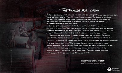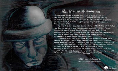


In these days of visual advertising and diminishing attention spans, it is hard to come across a copy campaign and even if you do, the chances of it being great are slim. Perhaps we've lost the art of writing well or perhaps nobody has the time. Here's a campaign for the London Transport Department by a few students from the Miami Ad School in USA. Nice work here. The only problem might be the font which is hard to read at times and a few typos here and there. But I like the effort behind this. Quite a good read.
Art Director: Regner Lotz >> Copywriter: Niklas Kristensen & Matt Foley >> Illustrator: Regner Lotz


4 comments:
cant read the copy..but the artwork --
c'mon
its horrible
I have learnt a lot, today!
terrible artwork. looks like a really cheap scan.
i´m bored
long copy lives.
Post a Comment