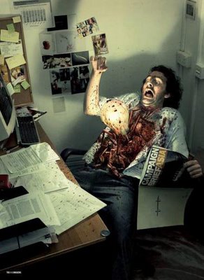
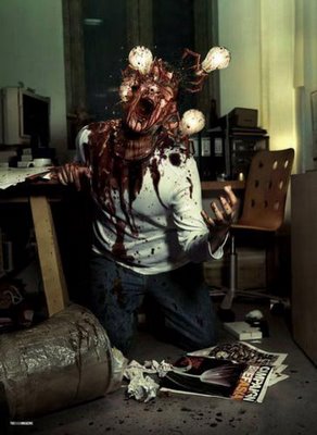
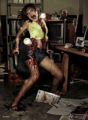
This is a campaign for Organ Donation but it kind of scared me rather than convincing me. Did it do the same to any of you guys? I have an opinion that showing a lot of gore in ads often make them repulsive and even hard to watch. Making you lose a prospective viewer rather than the curiosity or convincing factor. This campaign did just that too me. Does anybody feel the same too??
Monday, February 06, 2006
Kenstar @ the One Show Showcase 06!
This campaign from Quadrant Mumbai is a part of the One Show Creative Showcase 2006. Amit Achrekar, the copywriter behind the ads says that the real challenge was the fact that there is a market full of air conditioner brands that propagate ‘cooling’ as their proposition. “So, since Kenstar is also about the cooling factor, we had to make sure that the visual idea was different enough to cut ice with the consumers.” I like this campaign, pretty easy and well executed. :)
Friday, February 03, 2006
HIV+ Mousefear! Web Banner
I've tried to load the HIV+ Mousefear Web Banner out here. I hope you guys can watch it and enjoy it. Hope this works! :)
Bad Ad or Good Lubricant?
This is an ad for Gel Manix, a lubricant. From my little understanding of global languages I think this was done somewhere in France. But there's something about this ad that makes me not like it a lot. Can't really figure out what it is! What do you think, is it just about delivering the message or is the manner in which you do it a important as well? Judge for yourself!
HIV+ Mousefear!
Found this amazing web banner against HIV Discrimination. I really loved it. I wanted to post it here but never knew how to do it. Can anybody help me with that? I'm just posting it in an image format for all of you.
It's got a damn cool idea that is supported by some even cooler execution and tells you the message loud and clear. Does anybody know the agency that did this web banner? Stunning Stuff!
Thursday, February 02, 2006
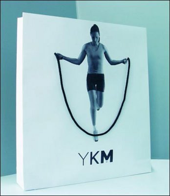
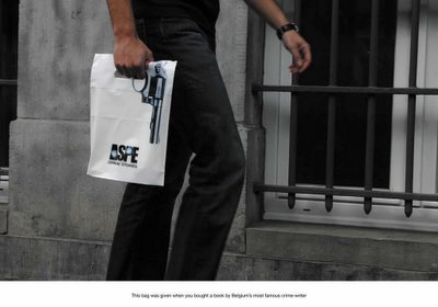
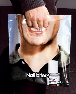
Bag-vertising?
More and more shopping bags are getting innovative and interesting with each passing day. I love the fact that clients and agencies are waking up to the fact that advertising is not just restricted to a print ad, a TVC, a radio spot or a billboard but every single aspect of a client is a part of his/her advertising. A philosophy that will lead us to seeing more stunning work in the most unexpected categories that may not be even defined in the current scheme of things. All these 3 pieces deserve a standing applause for what they are. Great work.
All Incoming Free!
aaaaaaaaaaaaaaarghhh!!
I remember the first time I saw the first Campaign Brief Campaign in a One Show Awards Annual and I was like, hey that's a fresh idea. It had never been done or tried before...
And then they did the same idea again (just executed it a little differently) and now they are back for the third time with the same idea executed a little more differently! I mean, move on. The idea ha become a stale one and no matter how differently you try and execute it, it is not going to matter!
Get an idea that pushes the same thought process forward or move along and get a whole new one. And by the way, this campaign is kinda ugh! and I still don't know if everybody gets the message at the end of the day.
Times Matrimonials
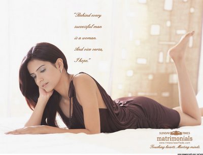
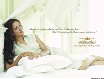
A campaign for the Sunday Times Matrimonials from Vyas Gianetti Creative, Mumbai. I like each of the headlines. Remember, the T.A. here would probably be the young urban Indian and the ads do the right thing by talking in a tone and manner that bring out the most important aspects that he might consider while finding a dream partner.
I recently saw another matrimonial TVC where the husband virtually acts like a dog following his wife's instructions and the ad ends on a note the one must choose a partner with care or something like that. I somehow like this aaproach better.
Pandey Ji & the Scam Saga!
Looks like some controversies never die and the debate shall go on. Found this Interview with Mr. Piyush Pandey via agencyfaqs. I thought it would be great to know your opinion too. Read on and speak your mind:
‘Scam ads’ is all about bad losers spoiling the party
Ogilvy & Mather India's chairman & national creative director, Piyush Pandey, has been in the eye of a storm lately with virtually half the Indian advertising industry speaking in hushed voices against his domination of the Abbys and even accusing him of indulging in 'scam ads' to win awards.
Pandey, who has maintained a low-profile during all this time, comes out in the open for the first time to takes on these accusations and his detractors in the industry head-on. And in-between, he also speaks on how advertising is selling itself cheap and creative trends to watch out for this year.
Excerpts:
You have been accused of running Abbys as O&M extension?
People shouldn't blame O&M for their failures. Please stop behaving like bad losers or you'll spoil the game for young people who're the future of this industry. Some people have short memories in this industry and they should refresh it a little bit. They may like to do a little homework too. And this isn't about Abbys. They must check from the inception of the Advertising Agencies Association of India (AAAI) till when O&M stopped participating - who's work dominated the AAAI awards? Till the A&M awards closed down, who dominated these awards?
Till such time O&M stopped participating in the big-bang awards in Bangalore and Chennai, who dominated it? Basically, if young people at O&M did good work and you did not, why blame us? So therefore, if you have a personal agenda of either living up to your secretarial responsibilities this year, please don't blame O&M for it. Life is too short, let's try and admire the good work and get on with it.
Some people also point out that some of your award winning work is basically 'scam ads'?
I think people should look into their own work, their own one-offs. Look at their own victories before they start pointing fingers at others. And those who have issues against awards and one-offs should look at their own awards and their acceptance of being on the jury of international awards, despite claiming not to believe in them.
What are the 'creative trends' in advertising for this year?
Manifestations of reaching out to people will change with availability of new mediums in mobile, internet and radio. What will not change is the value of an idea. Human emotions will not change. But, there will be experiments on new ways of presenting it to consumers. Communication will have to keep in line with the evolution of a society. For even while we have the new-age bold cinema in India, the Advertising Standards Council of India bans a VIP Frenchie ad, which does not show any people, least nude or semi-nude models!
The society will find its own balance, and if need be, will go back to its roots to find answers. Look at the new film, Rang De Basanti. I think it's good, for it tries to address today's problems by using the past. The message is clear, you can't write away your past.Do you see advertising discipline maturing in India?In India, the ad industry is little less aggressive than it should be. It usually sells itself cheaply. It is sad that this industry doesn't behave like MF Hussein, who doesn't work on a turnover target but a dream, an idea.
If you plan your life around (financial) targets, clients will use those targets against you. But an idea doesn't come cheap. The ad business should, once again, start living the ideas, start valuing ideas, take more pride doing what we're doing and charging clients for it. We should get into a scenario of a stronger sales-driven compensation.
How does the ad market look this year?
The market is looking good. Clients are doing well, and they'll be experimental this year. They will invest in new media in a small way. I hope you won't call it a 'scam ad' next year.
Via: The Economic Times
Wednesday, February 01, 2006
Z II E II B II R II A II crossing
Another creative from Ogilvy Mumbai for the Mumbai Traffic Department but it just seems way to dated for my liking. If this Ad was done say 3 years ago, I would have said nice but I just don't get the feeling that it is something that hasn't been tried before. This whole image manipualtion thing does not have the impact of a creative that hits you unexpectedly or in that manner.
Sargam by Ogilvy, Mumbai
Neil French Apology!
Advertising is the most fun you can have with your clothes on...but keep them on coz you never know what could happen once you take them off! Ad Guru Neil French and his controversy at Toronto is a thing of the past but then it looks like the man is back with an apology...if you can call it that. Read on to know what he has to say about the whole incident...makes a good read.
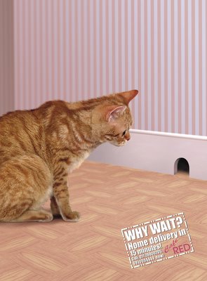
Cafe RED by Lowe, Delhi
The team of Priti Nair, Udayashankar rao, Brijesh jacob, and Suraj Kumar are the brains behind this campaign for Cafe Red in Delhi. I somehow believe that december often is the best month for creative ideas from across the world. May be it has to do with Santa Claus. :)
Jokes apart, I like the way this campaign tells me that there is a quicker alternative available. May be the art could have been better, but then again it is december and ther's so much more to do!
Adopt, a saner approach to creativity!
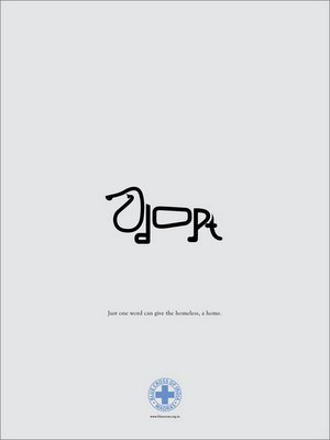
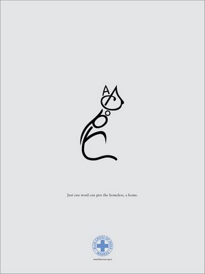
I generally like most of the work from 1pointsize and am of the general opinion that chennai gets most of its best creative campaigns from there. This campaign for the Blue Cross of India left me a little dissapointed. I get the fact that being creative and delivering a certain message in an interesting manner makes a big difference in the way the message is recieved, But what if the message is completely lost in acheiving the creative aspect of the ad?
I showed this campaign to almost 15 people and barely 2 of them got what the typography was trying to tell them. Maybe it's the execution or the idea itself but I just don't seem to think that this is a great campaign. Especially because it is not a niche product where it is OK if only a few people get the idea. It's adoption and that is an extremely generic sector of people you are talking to. Anybody thinks otherwise, shout it loud! :)
Tuesday, January 31, 2006
Alter-Ego by Bournvita
Ogilvy, Mumbai is the agency behind this campaign for a health drink named bournvita. Sure to work with the kids because I know how badly I wanted to be Superman when I was Six! To see my name in that font would have been like cloud nine. This one should be extended into a Direct Mailing Exercise where the message is customised so that each could feel as great and try the Bournvita Power! I think it would work well, what say you??
Friday, January 27, 2006
Wellaflex Hold
Thursday, January 26, 2006
my body gym!
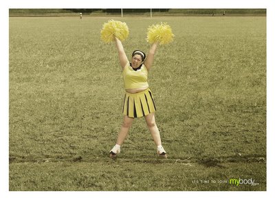
This campaign from Ogilvy for a gym named "my body" is a little convoluted! I think its a campaign but its strange coz' each of these ads look like they are from different campaigns. The ads don't seem to have that general campaign feel to them. Is there a rejoinder that anybody can see to make sense out of this campaign?
Subscribe to:
Posts (Atom)