Wednesday, December 07, 2005

Shut Up by FCB, Portugal


Category: Public Services
Agency: FCB Portugal
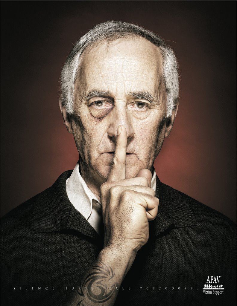
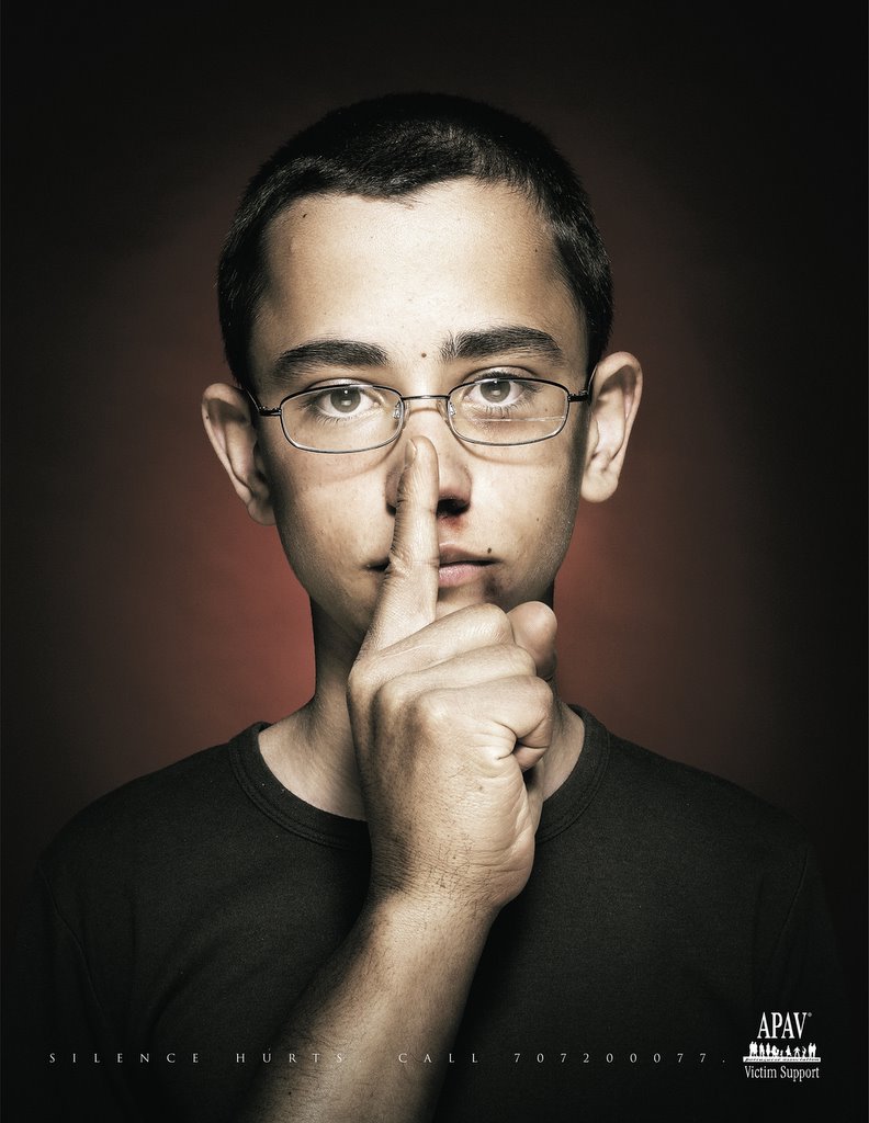
Headline: Silence Hurts.
Client: APAV Victim Support
Country: Portugal

This 4 ad campaign might be a little subtle because I did not get it till I took a closer look at the ads for a second time. I felt they deliver the message pretty well and intrestingly. I feel that the injuries on the faces of the victims should have been a little more pronounced (look at the last ad to see the difference) because the clear faces now leave it upto the viewer to look at the hands which all of us might not! But even otherwise, these are quite intresting in the kind of treatment delivered to each of them.

Volume Mouse Anyone??


Oh my gawd! This one was purely disgusting. Yuck! How could a poster like this push anybody to but a bottle of Garnier Mouse...I simply don't get it. Anubody finds this funny, cool, clever or great?? This poster from Publicis, Stockholm is simply so yuuuuuuuuuuuuuuck!! (But then, that is my opinion!)

Tough Plastic!


Well, I did not know how to react to this one by Y&R, Malaysia. While the message is loud and clear...does it scare you? does it make you think of something else? This ad brought out a few mixed emotions from me!

Find the Musician in your Kiddo!


Category: Entertainment Services
Agency: EURO RSCG
Client: RED FM / 93.5
Headline: None
Country: India

Motorola in Milan


Now this is something you dont see quite often. Atleast not in my part of the world. Regione Lombardia rented for € 50,000 the face of the Pirelli Skyscraper to Motorola, who used it to deliver the biggest ad ever featured on a Skyscraper.

The ad, projected on a 4,000 sq. meter surface by 15 Stark projectors, enlighted the surface of the famous skyscraper for some nights (since Nov. 29th) and featured the new stylish cellphone just launched in Italy by Motorola. The light design is from Paolo Buroni, who cut the phone image in 15 parts and reproduced them on the face of the Pirelli Building. Stunning but true!

Via: www.adverbox.com

Tuesday, December 06, 2005

New TVC from Honda


This new ad for Honda was created by W+K, London. The 120 second spot was directed by Stink's Ivan Zacharias and features Andy Morris in the lead. I think this is currently the most popular TVC on almost every advertising blog on the world-wide-web. After Honda's COG and Grrr, it does look like W+K have a lot to live upto and they've done a good job on this one.
But then, I also believe that a COG and a Grrr don't come along everyday! Congrats to the team behind this ad.
Saatchi & Saatchi Malaysia cam up with this ad for Toyota Hilux. It put me off a bit when I saw it. I don't know if lots of other people find it pretty grose too. A few months back I saw a TVC for Ford with big huge monster monkeys in them, I then saw a Hummer TVC with Godzilla and King Kong in it. Now this! Does anyone smell addiction?? :))

:: SBI & Platinum ::


Saw this Ad for SBI Life Insurance today and it reminded me of this other ad done for Platinum some years back. I somehow feel they have the same kind of treatment and the copy is also in the same mould. Nice to know that some styles of writing can last a lifetime! PS: this is not an accusation against anyone. Just a casual note that there are similar parallels in advertising!

Tan on your Fries!


Anyone interested in giving your fries the TAN? An ad for BLACK & DECKER by GMASCO, Dubai.

Monday, December 05, 2005

One is Enough!!


Not everbody I showed this campaign to understood it entirely. I don't know if it is the style of execution, the way the message is being delivered or just the traditional way how we "advertising" people tend to look at all ads to see if there is a twist in an ad! But then, I live in India and we have our own way of dealing with things. Not everybody gets an extremely creative idea, especially if it is an evolved one. Look at the previous ad for what I mean is Simple!

The Inside Stuff from PEPSI

Now this is truly a masterpiece for me! I think it can't get any simpler than this. What simpler advertising can one do to explain the concept of Diet Pepsi to anybody, anywhere, anytime! Hats off to the entire team behind this beauty. It sure deserves a standing applause. You've got mine!

Flags from Grand Reportagem Magazine


Type of Ad - Magazine & Newspaper
Category- Publications & Media
Advertiser - GRANDE REPORTAGEM MAGAZINE
Client - GRANDE REPORTAGEM MAGAZINE
Agency, City - FOOTE CONE & BELDING, Lisbon
Country - PORTUGAL

This campaign was one of the most highly awarded creatives in the year 2005. Cannes, D&AD, One Show, The Clio, Eurobest, NY Ad Fest, and several others. Truly a demonstration of how one amazing campaign can make you world famous in a matter of a few months. Great Ads these are.

Saturday, December 03, 2005

Space in a S P A C I O.


Category: Automobiles
Agency: Saatchi & Saatchi
Client: Toyota
Headline: None
Country: Singapore
I don't understand this campaign entirely. Are they trying to suggest that the SPACIO is a car that has things neatly aranged so that there is a lot of space around the seats. Or is the campaign just trying to tell me that everything is organised in a SPACIO. If it is about suggesting just space, then why not have the seats in vast acres of open land or in the middle of a desert. (maybe they did not do that because it is a force fit that one would never find seats in a desert!). Does anybody have a better explanation of this campaign from Saatchi, Singapore??

A Kodak Moment!


I don't know which agency did this but I know that it picked up an Andy Award in 2003. I like the whole point of using the film in various aspects of celebration and happiness. No doubt, the term Kodak Moment represents happiness in so many parts of the globe today. Nice work!

Thanda Matlab Coca-Cola!


Category: Non-Alcoholic Beverages
Agency: McCann Erickson
Client: Coca-Cola
Headline: Thanda Matlab Coca-Cola
Country: India
There are some ads that very strongly and effectively use local language, local habits and surrounding to convey the message in an interesting way, this is one of them. This 2003 campaign for Coca-Cola won a Cannes Lion in 2003. I know that this is an old campaign but I thought it would be good to share it with visitors from other countries. PS: Thanda Matlab Coca Cola literally translates to Cool Means Coca-Cola!

Friday, December 02, 2005

Mix N Match! It's like Visual Typography...


Here's one more campaign from Decathlon. This one won an Epica in the year 2004. I like the style of mxing typography and visuals to convey the final message. Intresting and holds me back for that extra second to find out what the ad is telling me.

Magic in Photography!


Category: Fashion
Agency: 1 pointsize
Client: Perri Alley
Headline: Crafted From Nature
Country: INDIA

This campaign picked up about 10-15 International Awards last year and was done by 1pointsize. An agency owned and run by Mr. Sharad Haksar. Chennai's hotshot photographer who weaves magic and creates stunning ads time and time again. His agency was awarded the agency of the year at the Chennai Ad Club Awards in 2005. Most of his work features absolutely stunning photography. This campaign is truly brilliant for the idea and the way it has been executed.

BE GAME!


Category: Fashion
Agency: Fish Eye, Bangalore
Headline: Various
Client: SF Jeans
Country: India

I think all the work done for SF is a kind of a revelation to the Indian Fashion Industry. In each and every single piece of communication from this brand, I see a sense of attitude. It moves far away from talking about the product, its great material, the confidence it brings along, the fact that it can attract women, the pricing or anything else that we so commonly see on Indian Fashion Advertising.

Instead it tries to sell me an attitude. Nobody buys Nike today because it's a great shoe. We buy it because of the attitude it sells! Similarly, most SFAds make me feel a part of their own philosophy of "BE GAME" for anything that comes your way. I so badly wish I had written any of these ads. They are just so amazing if you try and understand the kind of attitude they bring along. Superb!

Low on price, High on Creativity!


I think this campaign is cool. I can't stop smiling every time I look at it. The whole point of taking something as cliched as reduced prices and putting a bizare twist on it is nice. But I dont think it is a great campaign or anything like that becoz I'm sure most creative people would have come up with something similar. What works here is the art that supports the idea wonderfully! PS: This won a Cannes in 2005!

s i m p l i c i t y . . .


I remember the number of times, we creative people at agencies are constantly cribbing about the fact that we have to come up with campigns even when the client does not have a budget for a lavish shoot of any kind. I wonder if this campaign came up because the client had no money to shoot or if this was just pure genius of coming up with a campaign irrespective of all the other factors like what budgets, which photographer, what medium, how big is the ad, etc, etc.

Thursday, December 01, 2005

This is the new Weight Loss Programme!

Product: Food
Client: Campina
Agency: Unknown
Headline: Only 0.1% fat
Country: Unknown
Medium: Outdoor

Not everybody will get this ad immediately but when you do I'm sure you'll be like OH! DAMN, why did'nt I think about that! Nice stuff. Picked up a few awards too...