Tuesday, November 22, 2005

Nike Retro-Running


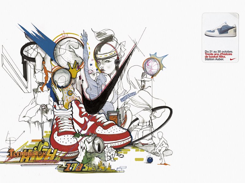
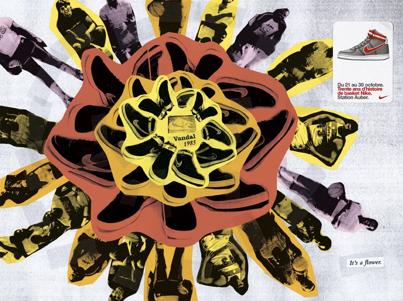
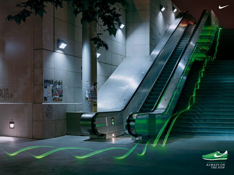
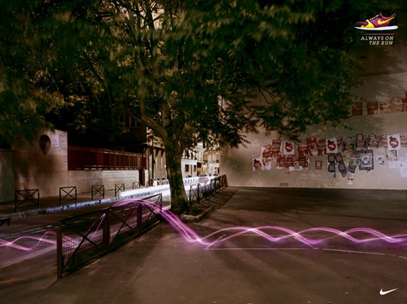
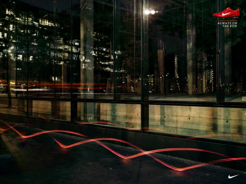
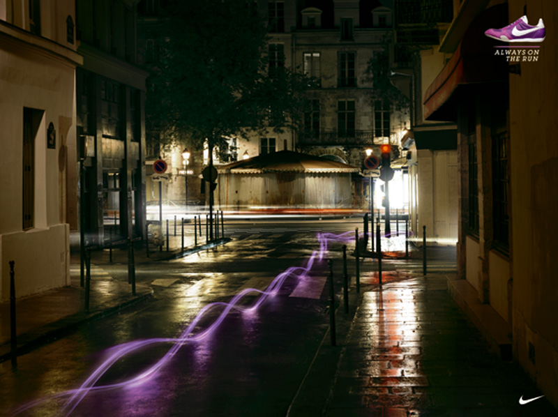
This is the latest print campaign for Nike by DDB Paris. The main idea of the campaign was to advertise the retro-running range (relaunch of mythical running shoes) and targets “metro” (urban men and women 25/35 years old, with affinity to fashion, style, trends).

The idea of DDB Paris was to take it from the specificity of those running shoes re-edition: they exist in a very wide range of colours. And to show them centrally in an urban setting, play-ground of our metro target.

By combining a product reality (running/colours) and a target reality (the speed of the city, a upbeat life) the campaign allows each one of us to relate to idea that one is basically “always on the run”, going from the office, to a drink with friend, to the movies…6 visuals were shot at night and represent both the trace of the car lights and the trace of the retro-running shoes (the night pushes the idea to live life to the full).

On some visuals, the trajectory of the trace represent someone that goes trough the city playing with it. The locations in Paris has been chosen to be relevant to the target, they are familiar but without being “cliché”. (Saint Paul, Canal Saint Martin, le Sentier; Pont de Bercy, la BNF…)

The campaign highlights the product by showing it in a universe that is very coherent with the style of life, aspirations of the target. Moreover, the execution is new, original, and esthetical. This campaign will be used also to announce the opening of the NikeStore on the Champs Elysee this fall, a billboard with a coloured trace going down the Champs Elysee can already be seen on the frontage of the future store.

It will also exist in retail and at the occasion of a special event, a race planned in November. This campaign for Nike France has caught the attention of Nike Europe which has decided to broadcast it in Middle East and Africa and also in 42 countries in both press and outdoor!

DDB Paris & the Nike Saga.


Product: Footwear
Client: Nike
Headline: Various
Agency: DDB Paris
Country: Paris

I just found a whole bunch of Nike creatives done by DDB Paris. Each of these campaigns is a classic example of breaking the rules and defying everything that has come to be accepted as a norm. I know that this campaign did win a Cannes Lion last year and I think the art direction in each of these ads is simply superb. A factor of expression that does go a long way in making Nike a philosophy and not just a brand like several others.

Slim, Slimmer, Slimmest!


This campaign for Sony Wega was done by Tonic Communications, Dubai. The first ad is a stunning idea but I feel the second one is a little weak and quite cliched. I've seen the same idea for Titan Slim done by Ogilvy, Bangalore...But then co-incidence seems to be a universal parameter in global advertising today!

Monday, November 21, 2005

David, Goliath & Other Stories!


This morning I came across a post on agencyfaqs about David and their new hoarding on Marshalls Road. I saw the creative almost 2 weeks back and I simply loved it that very moment. I like the fact that someone is fearless and forthcoming about speaking their mind (those who know Melvin better must know what I'm talking about) without worrying about all the red tape that goes on in advertising circles and huge global corporations, especially after what happened to Mr. Neil French in Singapore. (Not that I think he was right in any way!)

But this is so typically the David Philosphy of grabbing the giant by its balls. Great stuff, Melvin Dude, you just rock...keep up the great stuff and I'm really glad you have the balls to make it happen. Goliath Bashing has never been more exciting!

Removes any kind of stain...are you listening Mr.Clinton?


Frederick Samuel has posted this interesting campaign for a washing agent called Meister Proper (Mr. Clean) that was done by Grey Dusseldorf. I don't know if I think its an amazing idea but I like the art...keeps me interested to know what the ad is trying to tell me. The mechanic and the little child ads seem to tell me that here's a detergent that works on all kind of stains. I only wish I could do a spoof like this sort on Mr. Bill Clinton, that would sure bring a smile and lots of interest value...would it sell, i really dunno!

Bizzare Advertising by BBDO!


Product: Bookstore / Retail Services
Client: ACME BOOKS
Headline: words take you closer.
Agency: BBDO Singapore
Country: Singapore

Just came across this bizzare campaign for a bookstore done by BBDO Singapore. The visuals in the ads seem to give me a perspective of looking at the story of each book from the readers point of view in an interesting and strange kind of way. The headline that reads "words take you closer" and the visuals of the readers perspective from the eyes, mouth and nose are a kind of psychotic combination of expression. Maybe I am entirely wrong in interpreting the idea itself. Do any of you seem to understand this campaign any differently?

Saturday, November 19, 2005

We all could do with a little TyPoGrAphY!


Product: Museum Exhibit / Services
Client: typemuseum.org
Headline: Typefaces you won't recognise
Agency: Abbot Mead Vickers BBDO
Country: London, U.K.

Continuing with the discussion on art directors, I love the fact that art direction has so many facets to it. Think of the innumerable number of factors like photography, typography, colour, illustration, design, layouts, fonts and several other thingst that one can play with to create magic out of a simple idea that originates from somewhere and ends up looking like something else altogether. This campaign for the type museum is a something that uses type interestingly...nice stuff!

An Eye for an Eye!


Product: Eye Care Service
Headline: Various
Agency: Almap BBDO
Client: Eye Care Foundation
Country: USA

I still remember the first time I saw this campaign when it won a Cannes Lion a few years back and I went woah! It was art direction that simply took my breath away the instance I saw the campaign. I've always believed that great art-direction has the instant ability to make even an OK idea look extremely stunning. This campaign is a pure demonstration of an average idea made to look like a billion dollars through stunning art. Something we copywriters can only dream about but need art to help us make it come to life! :)

Get yourself a Shampoo Planet Cut


Product: Hair Salon / Hair Services / Shampoo
Headline: Cut by Shampoo Planet
Agency: Kessels Krammer
Client: Shampoo Planet
Country: Germany

Is this campaign for a Shampoo or for a Hair Salon? I don't know really! Will a campaign like this make me want to get a cut at Shampoo Planet or try one of their products? I guess yes, it looks like a place that can do something interesting with my hair but I'm only wondering if I'd be interested in hair that looks like vegetation from some African Jungle?

Thursday, November 17, 2005

Sleeping Beauty by the Street!


Product: Singles/Dating Portal
Headline: "Don't wait for the love of your life. Meet him on Match.com"
Agency: Unknown
Client: Match.com
Country: Barcelona, Spain

When I think of creatives that go beyond the traditional medium like a print ad, an outdoor hoarding or a television commercial, I think this is a sparkling example of such an idea. I step out for lunch or I'm trotting back home thinking of something totally irrelevant and I see something like this.

Now while a traditional form of advertising would interfere with the thought of my jolly day or moment, something like this would grab me by the collar and keep me intrigued in an interesting way. Think about it, it grabs my attention without saying "I AM AN AD" and that's the kind of work that we need to see more often. Advertising that does not behave like advertising !

An eye for assembly!


Product: Assembly Toys (Furniture, Shelves, etc.)
Headline: For those with an eye for assembly.
Agency: Creative Juice / G1
Client: TAMIYA
Country: Bangkok

This campaign picked up a whole lot of national and international awards across the world last year. It reminds me so much of the kind of advertising thought that Bisley has created. Bisley thrives on the concept "An eye for Order" that they have pushed forward for almost three years and about 8-10 campaigns now. This one is similar too but I still like this campaign too. Nice...

Old Will Always Be Gold!


Product: Matrimonial Service Newspaper
Headline: Start Right
Agency: Ogilvy Delhi
Client: Hindustan Times
Country: India

There's some charm in advertising that has dogs, kids and old people in them. I remember one of my Creative Directors telling me that these are probably 3 things that one could rarely go wrong with. And over the years, I've seen a lot of films that use these paradigms to instantly elevate the script to make it so much better through just great acting or some great music.

Looks like this campaign fro HT Matrimonials does the trick by telling people to start right and make the best decisions for a life partner! I like the way its been done. Intresting Stuff that definetely brings a smile on my face each time I look at it.

Wednesday, November 16, 2005

Exact colour is the only thing that matters!


Product: Reproduction House
Headline: Not just color. Exact color.
Agency: Saatchi New York
Client: Hudson Reproduction
Country: USA

I often seem to be amazed by work that's different. As in attention grabbing without being so for the sake of it but doing so to convey a message in a manner that makes it more interesting. Look at this campaign done for Hudson Reproduction. It tells me that colour is the most important thing to this reproduction house yet keeps me intrigued as to what the message is form the moment I look at it. Intresting, great art and extremely effective in delivering the message.

I remember a print and outdoor campaign a art colleague of mine named Vipul Shah had done for a reproduction house name Repromen in Mumbai. This was about 4 years back when I was at Contract Advertising (I) Ltd...the visuals where cow dung dripping out of a cow's arse, puke in a toilet basin and I can't remember the third! (a baby coming out of a mother's womb I think?) And next to each of these were the C MYK values of a certain colour used in the layout...this campaign is quite similar in its thought!

Hair Rising Stuff!


Product: HAIR GEL
Headline: Tames the wildest hair.
Agency: Unknown
Country: Unknown

PS: If anybody knows the agency that did this please let me know!

I'm quite a hair-freak myself and I find it hard to step out of home every morining since I starting spiking my hair with hair-gel. It was only natural that I loved this campaign the moment I saw it. As a consumer who thrives on hair gel I can quite relate to what this ad is trying to tell me. I don't know if its the nicest gel on the planet but it does tell me that I can style my hair well and most of the time it is the most important thing I need in a hair gel.

Is this yet another advertising blog?

Welcome to twenty-four! A blog that aims to share some of the best and a few of the worst pieces of COMMUNICATION in its myriad forms, shapes, sizes and sounds. What makes this one different from every other advertising blog you've seen so far. Well, I don't think I shall tell you coz' I think it is better you found out! Welcome aboard, have a pleasant stay. I'm sure it will be a memorable journey...
SANDEEP MAKAM