 Now you know where to go to find fresh fish...and for fresh ideas!
Thursday, December 15, 2005
Baby...MY FOOT!
 Caring for your feet! Now this is a really great ad for Minery Foot Care Cream. I love the idea of equating a foot to a baby. Very cool execution and a brillaintly simple idea. This ad was done by Creative Juice/G1 in Bankok.
Use 1000 times!
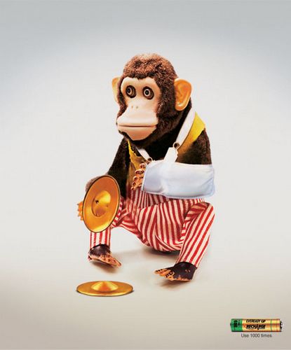

 Category: FMCG
Client: Eveready Batteries
Headline: Use 1000 times.
Agency: DY&R, MUMBAI
Country: India
Hop, Skip & Jump
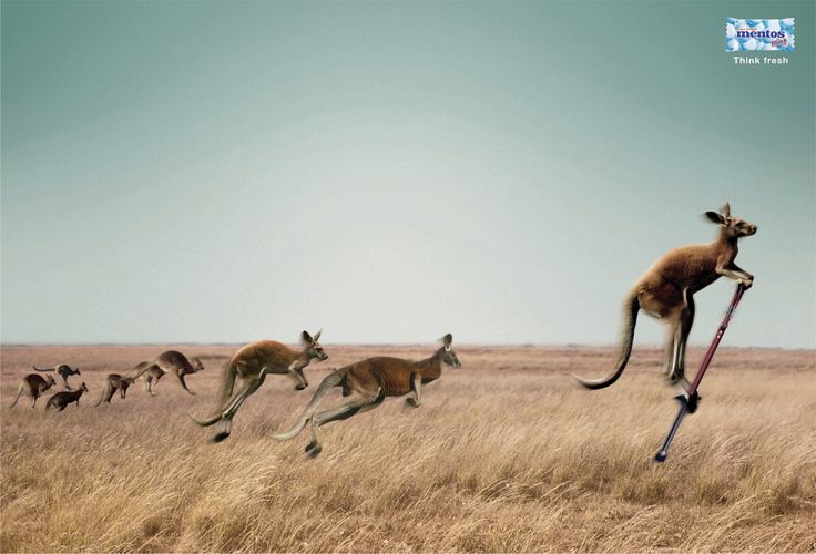
I don't know which agency did this ad. "Think Fresh"...what is with positioning statements these days. I recently read a post that described some 20 statements of the leading electronic brands across the world and most of them were plain rubbish and made no sense to the audience in any way. "Think Different" from Apple...now is there a link or a story to learn from there?
Momma's Milk!

I don't like this ad for Ammerland Diaries one bit. In this day and age where science has proven time and again that a mother's milk is best for a baby, using this kind of communication is not only showing the percieved audience a wrong message and also makes for some very dumb advertising. This ad picked up an award at the 2005 EPICA Showcase too. I don't know what the judges were thinking when they saw this one!
Wednesday, December 14, 2005
Say Cheeeeeese!
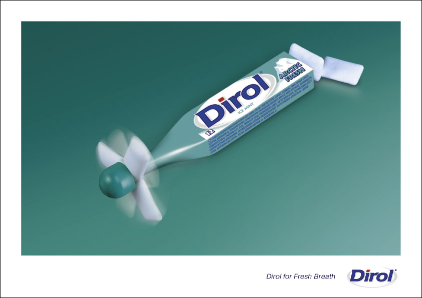
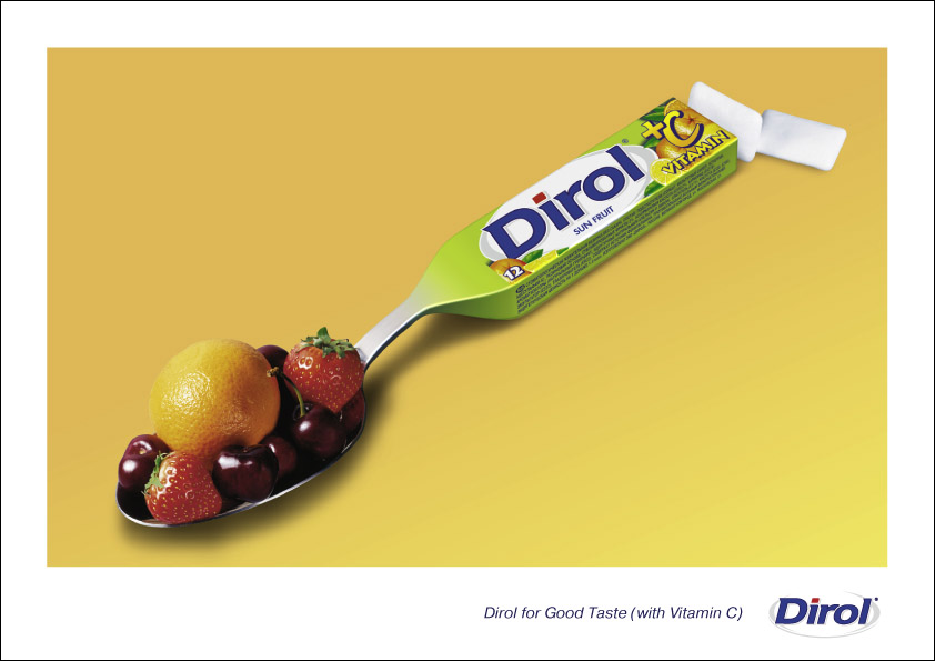
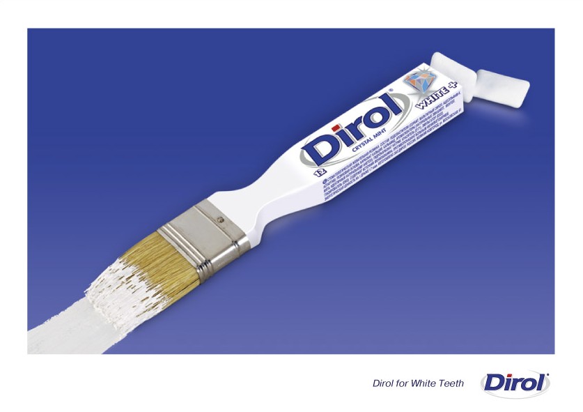
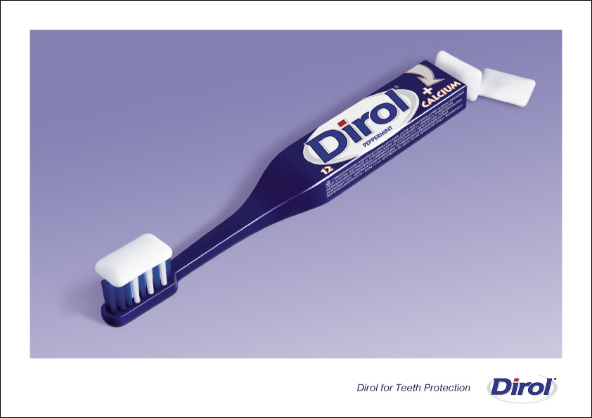
More nice work from DY&R Moscow. My only worry is Teeth Protection, White Teeth, Good Taste (Vitamin C) and Fresh Breath....is there anything that Dirol does not do?? I generally have an opinion that any brand should clearly have one great idea to sell itself to the audience. Can a brand say everything and get consumers to believe it? I think no. Anybody got more views on the same thing.
Veggie-Tubles!
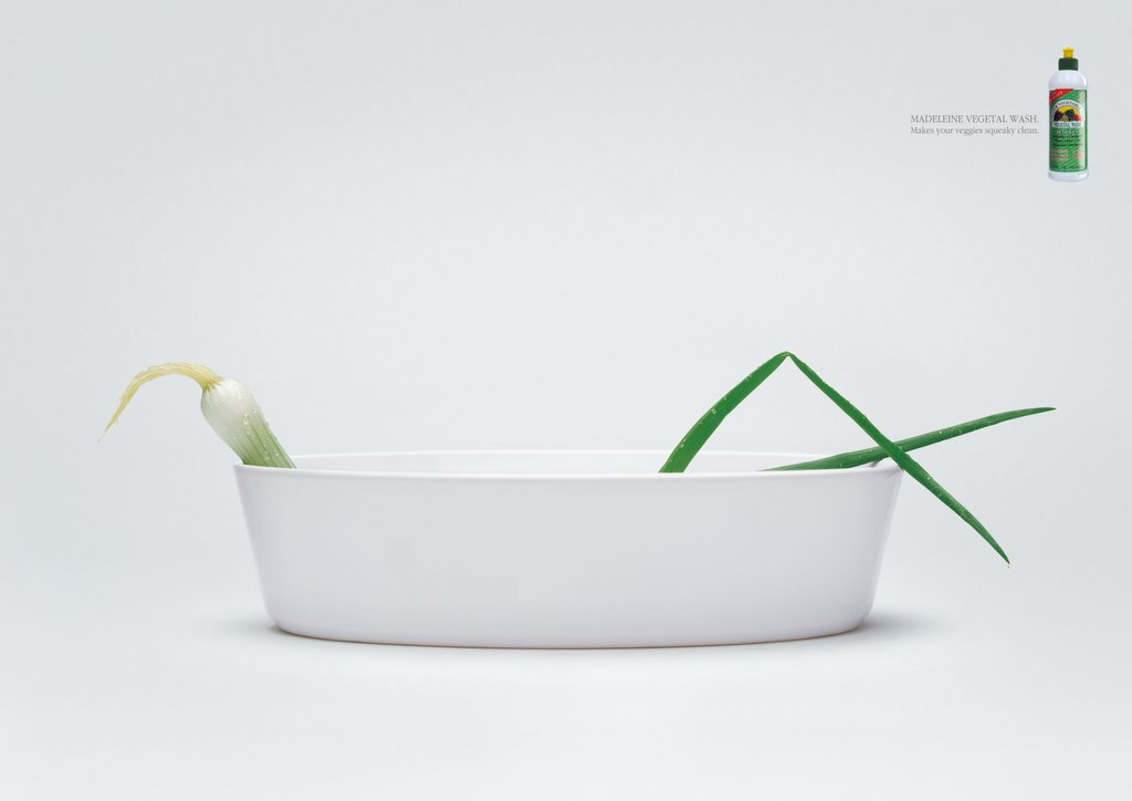
 DY&R Dubai is the agency behind this remarkably well art directed campaign for Madeliene Vegetable Wash Liquid that makes your vegetables squeaky clean! I haven't come across a similar product in India. But these 2 ads are extremely cool. I dont mind them as 2 huge posters on my wall. I guess that would be cool too!
Kangaroo & Hippo!
 Category: Automobiles
Agency: BBDO Portugal
Client: Nissan
Headline: More power for heavier loads.
Country: Lisbon, Portugal
Bizzare work this. Bizzare but with art that makes you go "how the f*!$ did they do that". That was exactly the reaction I had when I saw it at first. This is so cool isn't it?
Super Creative!!
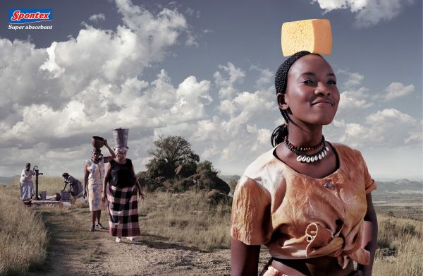 TBWA/Paris looks like it knows the true meaning of great work time after after time. Look at this ad titled "Well" for Spontex. It won Silver for Press (magazine) and Bronze for Outdoor at Cannes 2005. The simplicity in thought and in expressing the idea is amazing!
Foot Talking!

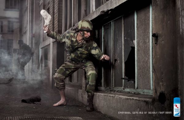

Category: Health/Medicine
Agency: TBWA
Client: Ephydrol
Headline: Gets rid of deadly foot odor.
Country: Paris
Awards Won : Cannes, One Show, D&AD, Eurobest, Epica & More
This campaign from TBWA is really funny. The huge list of awards the campaign has won is simply mind blowing. Very cool, indeed!
Smoking is Hereditary!

This ad from VVL BBDO reminded me of the Malboro Man Ad done by Piyush Pandey that won a One Show and a Cannes Lion a few years back. I really like the fact that somebody has brought out the point that most parents continue smoking in front of their kids without caring about how much they will be imitated when the kids grow up. Though I've seen a few other campaigns on this issue, this one struck a chord with me.
Tuesday, December 13, 2005
Humans For Animals
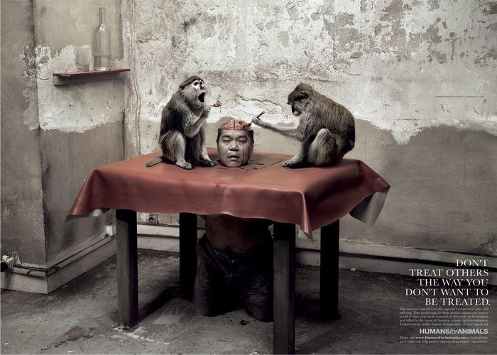
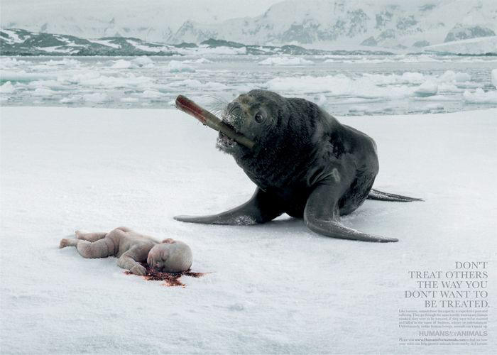
TBWA Paris is the advertising agency behind this shocking and bizzare campaign for "Humans For Animals". The campaign shocked me when I saw it first. Now this could draw a parallel to lots of other work that aim to send the message across by shocking the viewer. Would this campaign change anything in the way you think about animals??
Save the Trees, Save the Animals!
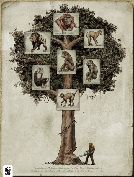
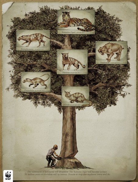
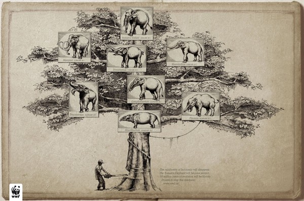
I don't know which agency did this campiagn for the WWF (World Wildlife Fund). But I find the message being delivered in the same manner as the format that RMG David seems to be taking it....Save the trees and you shall save the Animals. Scroll below to see what RMG did for the same cause. Do you think there is a similarity?
Economist - Well Red!
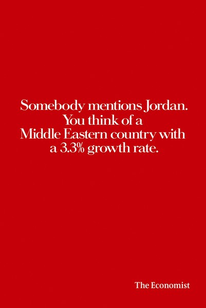
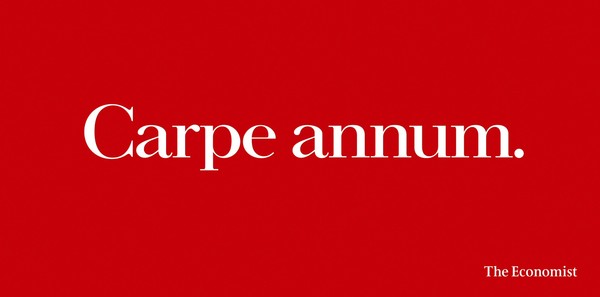
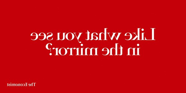

 These 5 Economist Ads won at the Eurobest Awards in 2005. This Print & Outdoor Campaign was done by Abbott Mead Vickers. BBDO, London.
Banned Belgian Anti Foie Gras Campaign
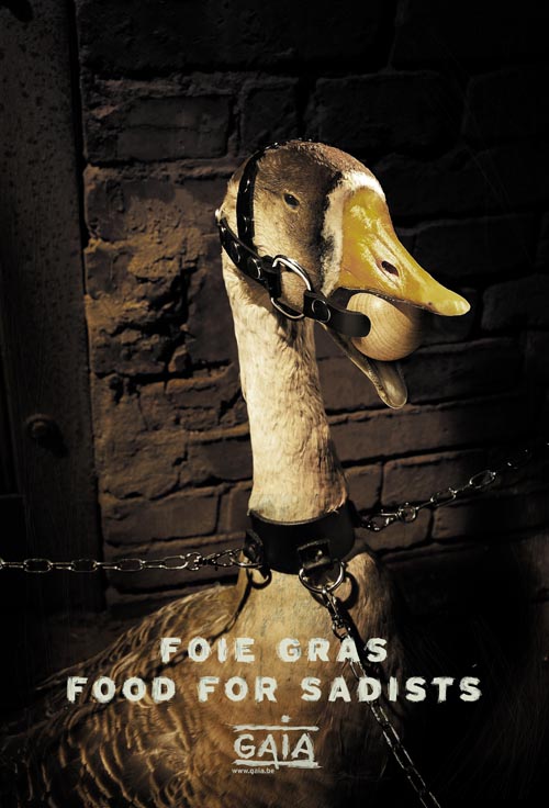
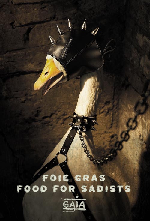
Thanks to Dubois Matthias for sending in this new outdoor campaign against foie gras (fatty liver), signed by Belgian animal rights activist group GAIA.
Foie gras - or “fatty liver” - is still a very popular Christmas and year end dinner dish across Belgium. Because most people don’t know that it’s made from the grotesquely enlarged livers of ducks and geese! The result of horrifyingf orce-feeding!! The campaign was supposed to run across 40 major Belgian railway stations…but the railway company refused the posters because they are “too shocking”.
I think that across the world, across agencies (atleast in my country, India), across cultures and across civilizations...shocking work is generally kept at a distance. Coming up with work like this is rare and when somebody does finally do it and it is killed becuase of fear, fear from authorities, from the public, from the government...it is only going to dampen spirits of creatives who even aim to come up with similar work.
I think the only way to deal with it is to fight back. I request everybody from the blogging community, especially Belgians to go ahead and spread awareness through this campaign...if it can't be done at a train station, it can always be done through the internet!
For More News On the Same:
Monday, December 12, 2005
1pointsize Public Service Series


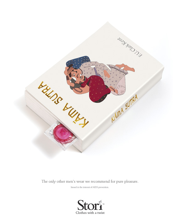
Here is a collection of 4 ads, all done by 1pointsize, chennai. The first one is against domestic violence, the second for AIDS prevention, the third for Blood Donation and the last is another one against AIDS prevention.
Simplicity is almost always a character amongst all work created by 1pointsize. And then again, you have the idea that tells itself through amazing photography time after time. My favourite is the Stori Ad. What's yours??
True Love Lasts Forever!
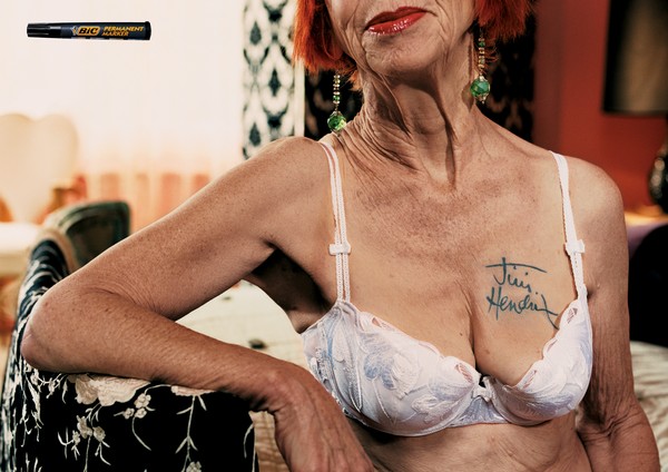
This ad for BIC Permanent Markers won a lot of awards including a Cannes Award last year. Simple and absolutely straight to the point. Nice work. I think TBWA was behind this but I'm not completely sure about it.
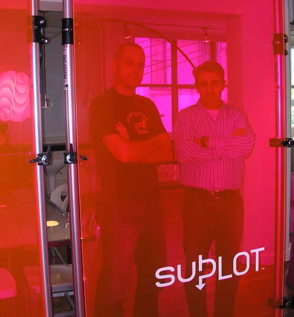
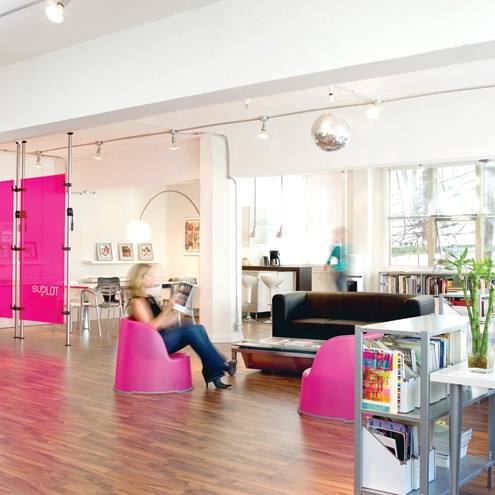
:: Interview of the Week :: Subplot Toronto ::
::cipher::

 ihaveanidea: And all this hot pink everywhere?
On the good side, the industry is so small here that everybody knows everybody. There are no horrible, bitter rivalries that you get in other big cities. 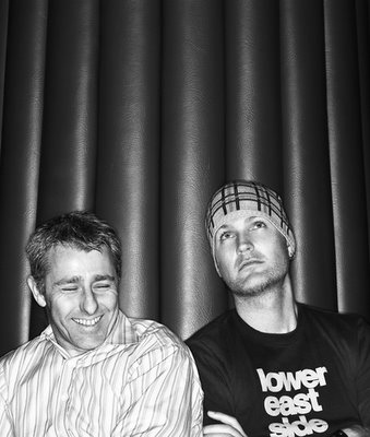
Starting this week, I've decided to share a few interviews on every Monday. The first one is from a fairly new design agency called Subplot in Toronto, Canada. The interview was done by Brett McKenzie from ihaveanidea. I like the kind of philosophy that makes Subplot what they are. The whole attitude that design is not just stuff that looks good but is more about good looking stuff with a deeper meaning that works in the real markets. Read on to know more. These guys are good!
We should’ve known the nice weather wouldn’t hold up. By the time we left Grey Northwest the weather started looking dreary again. Worse than that, our next agency appointment had to cancel our visit at the last minute. So what do we do with plenty of time to kill before ihaveanidea’s Portfolio Night that evening, but not exactly the best weather to kill time in? Marc Stoiber, CD at Grey, suggests that we check out this local design firm called Subplot.
He says it’s a fairly new shop, run by two cool former DDBers (I think everybody in this town worked at DDB Canada at some point!), one of who will be at Portfolio Night. Marc gives us the contact info, and soon Julie and I are on our way to Gastown, the oldest section of Vancouver, where many of the streets are paved in brick and cobblestone, and a public clock blows steam whistles to sound off the quarter-hour.
Now this “agency profile” was going to be different. All of the visits we’ve been to thus far on our trip to Vancouver were scheduled ahead of time. That meant I kind of had some idea of what I wanted to say before showing up. But this afternoon we were stopping by a place I myself have never heard of, with no time to do any background research. Plus it’s a design shop, and I admittedly know very little of the intricacies of design. All I had was assurances from Marc that it would be an interesting conversation.
Subplot Design is located in the Mercantile Building at 318 Homer St. near Cordova. Opened last year by Roy White and Matthew Clark, two former associate creative directors at Karacters.
Subplot quickly gained a reputation for great work. In their short existence, they have received awards from Applied Arts, Communication Arts, Creativity and the Lotus awards, and have been prominently featured in Strategy and HOW magazines.
But I found out about all those accolades after our visit. For now, let’s just sit back on one of their pink chairs with Roy and Matthew, and we’ll just let the tape recorder run, shall we?
ihaveanidea: So tell us, how did Subplot get started?
Roy White: We’re kind of new, we’ve only been going for about a year and a half. Matthew and I used to work at DDB. Within that agency is a design shop called Karacters, and Matthew and I were the associate creative directors there.
About two or three years ago, it got to the point where we just tired of the big agency model and lifestyle, and we wanted to be a part of something that was a bit smaller, a bit more nimble, and perhaps a place where we were a bit more in charge of our own destinies. We had that slightly, maybe arrogant belief that “hey, we can do this!” We sat around and talked about it for a little while. Finally we said let’s quit talking about it and let’s actually do it. So we left Karacters in 2003, opened our doors the following February, and we’ve been going ever since.
ihaveanidea: What’s the meaning behind the name “Subplot”?
Matthew Clark: “Subplot” is the idea that there are multiple layers to a story. There’s text, there’s subtext, there’s meaning, there’s always another story to tell. There’s a deeper layered meaning in the work we do. We don’t decorate things for a living, that doesn’t interest us at all. In fact I don’t think we’re terribly good decorators. We really like the deeper ideas and conceptual design work. There aren’t a lot of shops that do conceptual design in Canada, let alone Vancouver, so we try to offer that level of deep conceptual thinking. We’re also very good craftsmen in terms of design, but we have to start with an idea.
I’ll give you the runners-up of the other names we explored, because they’re even more telling! One was “Rant Creative”, because the two of us can get into these tirades, but sadly the name was unavailable. We also liked the name “Identical Twins.” We thought there would be nothing funnier than us walking into meetings and introducing ourselves by saying “Hi, we’re Identical Twins!”
Roy: We’re the only ones who found that funny.
Matthew: Plus if you search “identical twins” on the net, you come up with a bunch of porn sites, so we thought we’d back off from that name. So that’s how Subplot came about.
Roy: And it’s worked well for us. It’s a lot more memorable than naming your place after the partner’s names.
 ihaveanidea: And all this hot pink everywhere?
Roy: The pink came around mainly because we wanted something very un-corporate. When we were both working on our identity and coming up with ideas for the logo, we said we wouldn’t jump ahead and start thinking about colours before we needed to.
But both of us had this idea in the backs of our heads, and independently we were both thinking pink. So one day I said to Matthew “I just got this thing about using a colour like pink,” And Matthew pulls out a swatch he had already put together with different kinds of pink. So that’s how we decided on pink.
Matthew: Now if I could just get my mother to stop buying me pink things. My Christmas presents were all pink letter-openers and business card holders.
ihaveanidea: How big is Vancouver’s design community?
Roy: It’s very intimate. I was quite surprised when I came here. I’m from the UK, where there’s a much bigger design industry. Generally speaking, in the UK, design companies tend to specialize, so you’ll have a place that just does packaging, or a company that just does brand identity. Here, everybody pretty much seems to be a jack-of-all-trades.There are good and bad sides to this.
The bad side is that I think the industry here is still taking baby steps, and there’s a lack of appreciation for good design from a client’s perspective. That can be a bit frustrating sometimes. In Europe, clients are generally much more educated, where here, it’s a lot more of a hard-sell to get people to appreciate the value of design and the difference it can make to their bottom line.
On the good side, the industry is so small here that everybody knows everybody. There are no horrible, bitter rivalries that you get in other big cities.
Matthew: It’s strange from a student’s perspective when it comes to getting a job in this town. There are maybe only three or four big shops in Vancouver that actually have regular hirings, then there’s a complete vacuum in the middle when it comes to medium sized design firms, and then everything else is comprised of two, three or four man shops staffed only by the firms principals.

So here in Vancouver, you either have to go work for a big firm, or you start your own shop. The lack of medium sized firms in this town can be very frustrating. It seems like a lot of companies get up to nine or ten people and then they just implode. Very few firms ever get big and actually thrive.
Roy: The big companies tend to offer lots of big strategies and front-end stuff that’s very expensive, and clients often shy away from that. The small companies tend to have great craftspeople, and they do beautifully crafted little pieces of design, but when you look at it, they’re really thin on concept.
Matthew and I, having worked at the big companies and having the experience of big agencies, plus with our design knowledge, we think we can fit somewhere in the middle. So clients who don’t have the huge budgets to run to the big agencies can come to someone like us.
ihaveanidea: You mentioned that clients out here don’t often have the knowledge of what good design is. How do you overcome this?
Roy: It’s our job to help them understand the value that good design has to their business. One way is that we will not let a designer walk though our door and say “I kinda did this thing this way cause I thought it looked kinda cool.”
Our rationale is that you have to be able to justify everything you do. If you don’t, we will be perpetuated as an industry that just does pretty looking things. People will only take our industry seriously when we start having a serious opinion, a rationale and reason behind everything. In every other area of a client’s business, there’s a reason behind why they do things, so why should it be any different for design?
So we’ll go to our clients and say “this is like this because…” or “we have gone for this hierarchy because…” or “we have positioned your company this way because…” For us, it’s all about not only being able to justify what we do, but articulate it as well. Unfortunately there are a lot of designers around who don’t articulate what they do. They think they can simply show something to a client and think that’s going to be enough. And that’s how clients begin thinking that design is this arty-farty, nondescript industry that just comes up with cool things for the sake of doing cool things.
ihaveanidea: Are most of your clients in Vancouver?
Roy: They are at the moment, but that’s mainly because we’ve only been going for just over a year and a bit, so we feel we have to concentrate on getting some homegrown clients first. It’s funny, a few people have said to us that we should be working for more US based or Toronto clients, because they’re the type of people who would appreciate our work.
ihaveanidea: How do you go about attracting new clients?
Roy: That’s one of the things that has proved to be most challenging for us. Matthew and I are both designers, but we don’t profess to be businessmen or salespeople. We really just had to learn how to do it. We’ve had to pound the pavement a bit. We’ve been in the industry a long time, and when we left Karacters, we thought we would just walk into some new projects. But we didn’t, and we had to almost pay our dues all over again. But we were prepared to do that, and I think our portfolio speaks to our successes.
Matthew: Our client success rate has been achieved by far with referrals. Knocking on doors and visiting people, that’s a long haul! A lot of the people in this city need that first step, which is convincing them that they need design. I mean, good lord, when you have to start from there, it’s a really long sell! Because you’ll spend all this time doing THAT pitch, and then finally say “oh, and by the way, you want us!”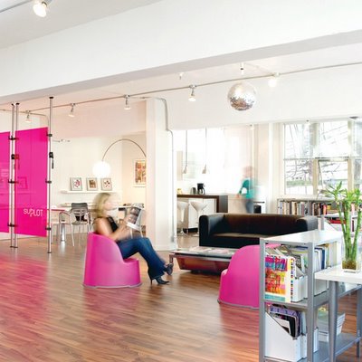
Roy: (laughing) “Oh, and by the way, this is how much it’ll cost!”
ihaveanidea: From our visits to Vancouver advertising agencies, we’ve gotten the impression that one of the main differences between Toronto and Vancouver is that in Toronto, your life revolves around work, whereas in Vancouver, you get to enjoy life a lot more.
Is this true in the design world as well?
Matthew: It has some truth to it, but it’s a bit of a lovely, attractive myth about here. It’s really sexy to say “oh yeah, I go mountain biking every day after work, and I go skiing every weekend.” Nobody does. People who work a waitress job might, but this a professional industry where you work your ass off.
Now I don’t think we have the exploitation that I’ve heard about Toronto, where you pay people a junior rate and make them work until midnight. That’s not hard work, that’s exploitation. But every professional that I know works their ass off, and if that means nights and weekends, then that’s the way it goes.
We have a much nicer environment, and people do take advantage of that, but I never met a person in my life who would answer the question “what do you do?” with their lifestyle. It’s nice to think that this is one beautiful lotus-land, where we all smoke pot and go up to Whistler every weekend, but it’s totally not like that.
Roy: BUT, having come from London, which is a bit like Toronto, I left London for those very reasons. It’s what we call in London the “work work busy busy chop chop bang bang”, where you’re like a little hamster on a wheel, and you are determined by where you live, what car you drive, what school your children go to, and what job you hold and that’s it. Before you know it, you’re twenty years older, you have a mortgage and a pension and that’s your life gone. I didn’t want that, and that’s why we moved over here. While it’s not this whole tree-hugging image, there’s a general sense that people are more laid back here.
I haven’t worn a tie since I came to Vancouver, where I wore a tie two or three times a week in London, even as a designer. I can’t remember the last time I did an all-nighter here. In London, it was so busy, I’d end up sleeping on the studio sofa and getting breakfast at the local café at least once a month. And when I worked at Karacters, we used to travel to Toronto a lot to see clients there, and whenever we went, the mentality reminded me of London. That’s why I wouldn’t want to live in Toronto.
ihaveanidea: Where do see Subplot in, let’s say, five years?
Roy: Definitely not the biggest design shop in town, but the most creative. I’d like for people both in the industry and on the client side to perceive us as the design shop that comes up with great ideas. We have no aspirations of being huge; our maximum size is about six to eight.
Matthew and I are both designers and we want to remain designers. We don’t want to become businessmen and hand off creative to other people. We think we’ll stay nimble enough to work with smaller companies and organizations, but big enough to compete with the big shops in town. Creative success is what drives us, not business success.
Roy: The first year was good. We made a bit of money, and creatively we did more than we ever dreamt we would.
Matthew: Where do we see ourselves in five years? Hopefully still in business! A salary might be nice too.
Roy: I think the 2010 Olympics is going to play a key role in the next few years in our industry. It’s such a big thing, and the ramifications are gigantic. They’ve already announced Tier 1 sponsors, and they’re soon to announce Tier 2 and Tier 3 sponsors, and the amount of money companies and organizations are going to be committing to advertising and design budgets to promote their sponsorships is going to be huge. I think it’ll boost the advertising economy and the design economy over the next three or four years.The big test is what happens after the Olympics, whether the whole thing implodes, which is what happened in Sydney.
I worked in Sydney on the 2000 Olympics and left before it all started, and it was a very similar advertising and design industry there at the time. A couple of big shops, and a bunch of small ones. Then two years before the Olympics, the all the big boys came into town and bought up the small agencies and design firms, because they thought they’d get a piece of the action. A few years after the Olympics, the Games have left town, there’s not enough work to go around, and everybody’s scratching for a living, and the design industry suffers. So it’ll be interesting to see what happens here.
Matthew: (laughs) That might be our downfall!
Wonder Why?
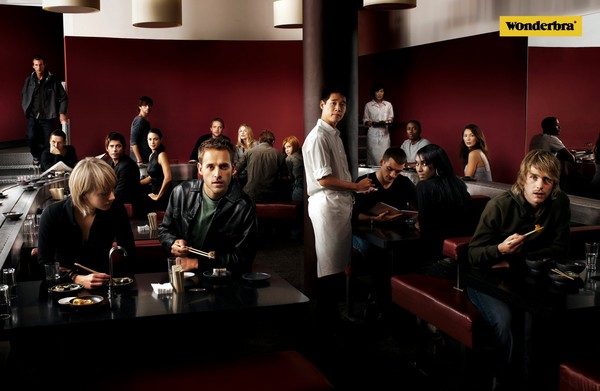

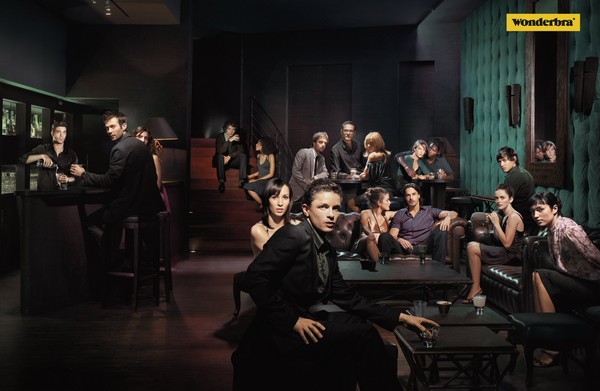
O.K., this is not a regular Wonderbra kind of campaign. Wonderbra has done a lot of brilliant work so far and I can't seem to fit this campaign into their existing style of creatives. It is one of those campaigns that is very off from their regular style of Advertising. May be it was a conscious decision to try something different from all that the agency has tried before.
This campaign won the "Grand Prix" in the print category at Eurobest 2005. Something I don't entirely agree to. This is good work but surely not something great or something unexpected, never tried before or even something stunning in terms of execution or interest value. I also think one could replace the wonderbra logo with ant other brand of clothing or accesory and still ensure this campaign was as effective. Anybody got another opinion on this campaign?
Confused Babies!


 I don't entirely understand this campaign. The headline reads "Young Director Award from KCP-C-Shots". Are these babies and kids posing or copying poses of great directors or actors? Can anybody explain who they are imitating??
Santa Cause!

Category: Food/Drink
Agency: TBWA
Headline: Merry Christmas with TABASCO
Client: TABASCO
Country: Paris
HO, HO, HO! :)


Category: Personal Products
Client: Friends
Credit: Madison Creative, India.
Art: Sanjay Kudale
Copy: Shardul Shaligram
Source: Magazine - Sakhi - (Gujrat, India)
Art: Sanjay Kudale
Copy: Shardul Shaligram
Source: Magazine - Sakhi - (Gujrat, India)
Country: India
Simply great work out here. I don't think there's someone who would not understand this campaign because of its relevance and its clarity. Madison comes up with this stunning campaign that is not only great execution but true in terms of a problem that exists in reality. Great work!
Subscribe to:
Posts (Atom)


