Wednesday, November 30, 2005

Breast Cancer & Russian Dolls

Category: Public Service
Agency: Ogilvy & Mather
Client: Unknown
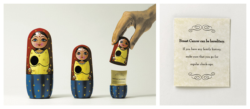
Headline: Breast Cancer can be hereditary.
Country: India

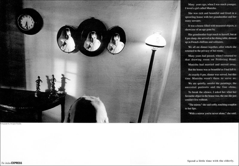
A totally new spin on Russian Dolls for a direct mailer done by Ogilvy & Mather. Normally Russian Dolls are considered advertising cliches because they are used to depict a lot of features in one product or to show the small size of a product or to show decrease in the value of something. This is a feature that has been used too many times. I like the fact that somebody has tried to do something fresh and interesting with the same Russian Doll.

Tuesday, November 29, 2005

Hard to Decide, Huh??


A cool and innovative way to showcase the kind of confusion a customer faces due to the wide range of options available at the Sunglass Hut. Brings a smile onto my face for sure.

Donors Wanted!


Category: Public Service
Agency: Duval Guillaume
Client: National Association for Organ Transplant
Headline: We don't have enough donors.
Country: Europe

This sweet and effective campaign was done by a European Agency named Duval Guillaume in Brussels. I don't know how many people in India would really get the idea behind this campaign because we are not used to the ticket or token system that is widely prevalent across Europe and the United Kingdom. This campaign shows patients waiting with tickets awaiting their turn to get an organ transpalnt just like a movie ticket or a ticket for a ride on a train or bus, etc. Somewhere down the line, the needs and wants of people are the same across the planet.

Page 3 for the Intelligentia!


Two days back, I was at the Crossword Book Sale in Bangalore and I came across a book on the making of the Economist Campaign. A lovely one I must say. It had about 400 different ads and about 1800 pages on the making of each ad, the thought process, the evolution of the Economist Brand Idea and more. And today I saw this ad. Via: Abdul Rehman

I'm amazed at the kind of dimensions a brand like the Economist can take. It reminds me about other great ideologies like the ABSOLUT Vodka Campaign, The TIME Magazine Campaign amongst several others. This ad talks about the Economist Page 3. A Page 3 for the clever, the intellectuals and the brainy.

PS: For those of you still interested, the official Page 3 is supposed to be brought out by the SUN Magazine. A bold new nude hot chick each day on Page 3. This one is for the Economist reader.

So thin, I think I love it!

Okay now this Guerilla Concept for Sony Cybershot blew my mind the minute I saw it. I don't think anything I write about can do justice to this brilliant idea. I have no clue when, where or who did this. But it's so damn simple, yet so amazing...advertising can be pure magic at times!

Ads for the entire family!


Category: Life Insurance / Services
Client: FAMILY PLAN
Agency: Unknown
Headline: At last someone thinks of the family.
Country: Unknown

I remember this campaign sweeping away loads of awards in 2002. I instantly loved the campaign for its very irreverent look at the whole point of Life Insurance. A same strategy that I see more often in Indian TVC's these days. Look at an SBI Life Insurance (old man and woman), a Kotak Mahindra TVC (money falling from trees) or many other ads and you will notice how much the Life Insurance Category has evolved over the years. These ads do the same thing in a very cool way. No wonder the Cannes, A One Show, a D&AD and a CLIO were awarded to this campaign.

Moved to e-bay!!


This is yet another great guerilla stunt done by e-bay in Belgium. They targetted stores that were empty or had just vacated their space and stuck stickers that read "Moved to e-bay". Super thought this. Brings a smile and reminds me that e-bay is an option for me to buy anything I have ever wanted in a very non obstrusive manner. Brilliant!

JEEP in the jungle!


Here's yet another great example of communication that touches the consumer in a very non advertising kind of way. This innovative guerilla stunt for JEEP was done by an agency called Contrapunto in Madrid, Spain. From the looks of the image it looks like it was done at a strategic location like a train station or something. Very cool thought. Amazinga!!

Body Bags!!


Category: Fashion
Client: Francesco Biasia
Agency: Unknown
Headline: Unknown
Country: Unknown

OK, the title was not what I meant. But look at this campaign...is this just advertising or is this that fine line where adevrtising goes much further and becomes art! I think advertising is an eclectic mix of science, commerce and art! This campaign for Francesco Biasia is stunning art, thoughtful science and pure commerce when you convince me that a product is a part of who I am and not just something that makes me who I am. Super stuff!

PS: Does someone have more details as to who and where was this campaign done??

Oslo Gay & Lesbian Festival!


Category: Public Events
Client: Oslo Gay Festival
Agency: Bates Redcell
Headline: Various
Country: Germany

Yet another German Campaign! I know that most of you must be squirming in your seats thinking what the hell was that! But well, I guess this whole Gay & Lesbian thing is more open and free-to-debate in most countries abroad. So much so, that they have ad campaigns announcing their festivals. While there might be this whole community of Gays & Lesbians in India, we still live in a hush hush environment, don't we?

Adidas Olympic Edition!


Category: Footwear/Fashion
Client: Adidas
Agency: TBWA, Berlin
Headline:Various
Country: Germany

This campaign was done before the Olympics. I love the retro feel that the campaign has. Nice art, I must say!

It's a really BIIIIIIG Burger!


Category: Fast Food/Restaurants
Client: Pow Wow Bar & Restaurant
Agency: KesselsKrammer (Assumed)
Headline: BIGGEST BURGERS IN TOWN
Country: Germany (Assumed)

This is an old campaign (2 years ago, I think!) done by KesselsKrammer, a german advertising agency run by 2 guys kessels and krammer. I have shown this campaign to lots of my friends and some of them think it's putting off while some others love it for its fantastic expressions and the whole idea of showing a big burger in such an interesting way. I like it a lot, the art just takes me by surprise and the visual is one that I shall remember for a long long time...

Saturday, November 26, 2005

Indian food is extremely good!


Product: Restaurant
Client: Curry on the roof.
Agency: Mudra
Headline: None
Country: India

This is a campaign done almost many many years ago by Freddy Birdy and Naved Akthar during their stint at Mudra. I also think this campaign picked up a whole lot of National and International Awards too. I still think the idea is a fresh one! Some great ideas never seem to go out of style!

Friday, November 25, 2005

The Axe Effect in the Shower!


Product: Health / Beauty Products
Client: Axe
Agency: Unknown
Headline: New Axe Shower Gel
Country: Unknown

As usual yet another classic from Axe. A brand that knows that sex sells like nothing else does and know how to use it with stunning impact time and time again. Awesome! Absolutely Axe-cellent!

Words are all I have...


Product: Public Service
Client: The Indian Express
Agency: Mudra
Headline: Long Copy (Various)
Country: India

This is one of my most favourite campaigns. I think it was done almost ten years back by the amazing and extremely famous copy-art team of Freddy Birdy & Naved Akthar. Being a writer, it is campaigns like these that keep my confidence about a few strong words creating an impact as any great visual would create. But in this campaign the splendid black and white photographs do add their own charm in delivering the message effectively.

Sometimes words can do such magic that leaves any visual far behind. Read them and if you feel that lump in your throat and a tear forming in your eye, you'll have just discovered the power of the written word!

For those of you who are curious, Freddy & Naved have moved on from Mudra and currently run their own advertising agency called the Shop based in Delhi.

{{A Lonely Planet}}


Product: Travel / Leisure
Client: Lonely Planet
Agency: Unknown
Headline: Feel at home everywhere.
Country: Unknown

Thursday, November 24, 2005

The greatest ideas are the simplest ones!


Product: Household Articles
Client: Pattex Glue
Agency: Unknown
Headline: Pattex Extreme. Glues everything.
Country: Unknown

I simply loved this campaign the moment I saw it. going back to the arguement I still think it had to be just one ad because it is a great idea and had to be a one-off. Anyways, it still is extremely simple yet absolutely effective in conveying a message. Does anybody know which agency did this campaign?

Cannes Lion for JWT & Red Cross.

Product: Philanthrophy / Public Service
Client: Red Cross
Agency: JWT, Chennai
Headline: When you give, we give.
Country: India

This ad by JWT picked up Chennai's First Gold Lion this year! Great work by Joono Simon & Charles Victor. Amazing!

An offer for Osama Bin Laden!

Product: Hair Salon
Client: Unknown
Headline: If you're too busy to come to us we'll come to you.
Agency: Unknown
Country: Unknown

I found this on a blog long ago. It's one of those ideas that I find really hard to forget. Very nice and extremely cool.

Is this really a big idea??


What is common behind all the four above ideas? Everything! I wonder how many more examples of mindlessly blowing a product into a larger-than-life size and putting it up on display somewhere should count as a big idea! Across continents many companies are trying this and it makes no sense to me.

Now if you want to really talk about what does make sense...look at the other examples below. Each of the following ideas are based on some intrinsic property of the product that has been identified and brought out in an interesting manner to grab attention. The difference is out here for you to decide...


I have more examples but there's always another time and another place! ;)

Lose the fat...


Category: Gymnasium / Health Club
Client: VIP Gym
Agency: Unknown
Headline: Get up and run
Country: Unknown

Found this great idea for VIP Gym today. The stickers were stuck behind chairs in strategic locations at restaurants, cyberparlours, pubs, bars and cafes close to the Gym. The line reads "Get up and move". Does anybody know which country this was done at?

Push the right BUTTONS.


Product: Fashion / Clothing
Client: Wonderbra
Headline: None
Agency: Unknown
Country/Region: South Asia

Well, with an ad so good, I dunno if I need to say anything at all. No clever headline. No long copy. No expensive shoot. No unnecessary body copy. Yet straight to the point. This is stunning stuff!

Direct News by 11 News!


Product: Media Services / News Channel
Client: 11 News
Headline: None
Agency: Unknown
Country: Thailand

This campaign won a gold lion at the 200d Cannes Advertising Festival. It made me laugh when I saw it first. But after a little thought, I think I don't like the idea of using the same idea to make it a campaign. It is the easiest and most natural extension you can find to any idea. What would have made it better is 3 great ideas independently and not one idea extended to look like 3 great ones!

Pipe goes the weasel!


Product: Pipe/Tube Sealant
Client: Relpipe
Headline: Various
Agency: Mudra
Country: India

This campaign for Relpipes is an absolute beauty! I think the art and the message are so stunningly connected. A factor that makes these ads hard to forget and their message extremely effective. Sooper Stuff!

Tuesday, November 22, 2005

Magic from Marcello Serpa


If there's one name in Brazilian Advertising that everybody on the Advertising Planet knows, it must be Marcello Serpa. Over 40 Cannes Lions, some 21 D&AD's, about 30 One Shows and still just in his 30's. Is he human or is there something else, I don't understand? He's created most of his magic at Almap BBDO

Among the selected group of clients who have worked with Almap/BBDO, we can find names like Audi, Antarctica, Patagon, Volkswagen, Miller Beer, Mizuno, Bayer, Havaianas, Pepsi, Visa and many more. The situation of Volkswagen is extremely special given the fact that in almost all the other countries the VW's account is handled by DDB Worldwide or its affiliated companies, but not in Brazil, where the advertising of VW is operated by Almap/BBDO (Penteado & Wentz, 2000).

Check out this recent campaign for Volkswagon done by the Marcello Serpa Team. This man is simply brilliant!

Nike Retro-Running


This is the latest print campaign for Nike by DDB Paris. The main idea of the campaign was to advertise the retro-running range (relaunch of mythical running shoes) and targets “metro” (urban men and women 25/35 years old, with affinity to fashion, style, trends).

The idea of DDB Paris was to take it from the specificity of those running shoes re-edition: they exist in a very wide range of colours. And to show them centrally in an urban setting, play-ground of our metro target.

By combining a product reality (running/colours) and a target reality (the speed of the city, a upbeat life) the campaign allows each one of us to relate to idea that one is basically “always on the run”, going from the office, to a drink with friend, to the movies…6 visuals were shot at night and represent both the trace of the car lights and the trace of the retro-running shoes (the night pushes the idea to live life to the full).

On some visuals, the trajectory of the trace represent someone that goes trough the city playing with it. The locations in Paris has been chosen to be relevant to the target, they are familiar but without being “cliché”. (Saint Paul, Canal Saint Martin, le Sentier; Pont de Bercy, la BNF…)

The campaign highlights the product by showing it in a universe that is very coherent with the style of life, aspirations of the target. Moreover, the execution is new, original, and esthetical. This campaign will be used also to announce the opening of the NikeStore on the Champs Elysee this fall, a billboard with a coloured trace going down the Champs Elysee can already be seen on the frontage of the future store.

It will also exist in retail and at the occasion of a special event, a race planned in November. This campaign for Nike France has caught the attention of Nike Europe which has decided to broadcast it in Middle East and Africa and also in 42 countries in both press and outdoor!

DDB Paris & the Nike Saga.


Product: Footwear
Client: Nike
Headline: Various
Agency: DDB Paris
Country: Paris

I just found a whole bunch of Nike creatives done by DDB Paris. Each of these campaigns is a classic example of breaking the rules and defying everything that has come to be accepted as a norm. I know that this campaign did win a Cannes Lion last year and I think the art direction in each of these ads is simply superb. A factor of expression that does go a long way in making Nike a philosophy and not just a brand like several others.

Slim, Slimmer, Slimmest!


This campaign for Sony Wega was done by Tonic Communications, Dubai. The first ad is a stunning idea but I feel the second one is a little weak and quite cliched. I've seen the same idea for Titan Slim done by Ogilvy, Bangalore...But then co-incidence seems to be a universal parameter in global advertising today!

Monday, November 21, 2005

David, Goliath & Other Stories!


This morning I came across a post on agencyfaqs about David and their new hoarding on Marshalls Road. I saw the creative almost 2 weeks back and I simply loved it that very moment. I like the fact that someone is fearless and forthcoming about speaking their mind (those who know Melvin better must know what I'm talking about) without worrying about all the red tape that goes on in advertising circles and huge global corporations, especially after what happened to Mr. Neil French in Singapore. (Not that I think he was right in any way!)

But this is so typically the David Philosphy of grabbing the giant by its balls. Great stuff, Melvin Dude, you just rock...keep up the great stuff and I'm really glad you have the balls to make it happen. Goliath Bashing has never been more exciting!

Removes any kind of stain...are you listening Mr.Clinton?


Frederick Samuel has posted this interesting campaign for a washing agent called Meister Proper (Mr. Clean) that was done by Grey Dusseldorf. I don't know if I think its an amazing idea but I like the art...keeps me interested to know what the ad is trying to tell me. The mechanic and the little child ads seem to tell me that here's a detergent that works on all kind of stains. I only wish I could do a spoof like this sort on Mr. Bill Clinton, that would sure bring a smile and lots of interest value...would it sell, i really dunno!

Bizzare Advertising by BBDO!


Product: Bookstore / Retail Services
Client: ACME BOOKS
Headline: words take you closer.
Agency: BBDO Singapore
Country: Singapore

Just came across this bizzare campaign for a bookstore done by BBDO Singapore. The visuals in the ads seem to give me a perspective of looking at the story of each book from the readers point of view in an interesting and strange kind of way. The headline that reads "words take you closer" and the visuals of the readers perspective from the eyes, mouth and nose are a kind of psychotic combination of expression. Maybe I am entirely wrong in interpreting the idea itself. Do any of you seem to understand this campaign any differently?

Saturday, November 19, 2005

We all could do with a little TyPoGrAphY!


Product: Museum Exhibit / Services
Client: typemuseum.org
Headline: Typefaces you won't recognise
Agency: Abbot Mead Vickers BBDO
Country: London, U.K.

Continuing with the discussion on art directors, I love the fact that art direction has so many facets to it. Think of the innumerable number of factors like photography, typography, colour, illustration, design, layouts, fonts and several other thingst that one can play with to create magic out of a simple idea that originates from somewhere and ends up looking like something else altogether. This campaign for the type museum is a something that uses type interestingly...nice stuff!

An Eye for an Eye!


Product: Eye Care Service
Headline: Various
Agency: Almap BBDO
Client: Eye Care Foundation
Country: USA

I still remember the first time I saw this campaign when it won a Cannes Lion a few years back and I went woah! It was art direction that simply took my breath away the instance I saw the campaign. I've always believed that great art-direction has the instant ability to make even an OK idea look extremely stunning. This campaign is a pure demonstration of an average idea made to look like a billion dollars through stunning art. Something we copywriters can only dream about but need art to help us make it come to life! :)

Get yourself a Shampoo Planet Cut


Product: Hair Salon / Hair Services / Shampoo
Headline: Cut by Shampoo Planet
Agency: Kessels Krammer
Client: Shampoo Planet
Country: Germany

Is this campaign for a Shampoo or for a Hair Salon? I don't know really! Will a campaign like this make me want to get a cut at Shampoo Planet or try one of their products? I guess yes, it looks like a place that can do something interesting with my hair but I'm only wondering if I'd be interested in hair that looks like vegetation from some African Jungle?

Thursday, November 17, 2005

Sleeping Beauty by the Street!


Product: Singles/Dating Portal
Headline: "Don't wait for the love of your life. Meet him on Match.com"
Agency: Unknown
Client: Match.com
Country: Barcelona, Spain

When I think of creatives that go beyond the traditional medium like a print ad, an outdoor hoarding or a television commercial, I think this is a sparkling example of such an idea. I step out for lunch or I'm trotting back home thinking of something totally irrelevant and I see something like this.

Now while a traditional form of advertising would interfere with the thought of my jolly day or moment, something like this would grab me by the collar and keep me intrigued in an interesting way. Think about it, it grabs my attention without saying "I AM AN AD" and that's the kind of work that we need to see more often. Advertising that does not behave like advertising !

An eye for assembly!


Product: Assembly Toys (Furniture, Shelves, etc.)
Headline: For those with an eye for assembly.
Agency: Creative Juice / G1
Client: TAMIYA
Country: Bangkok

This campaign picked up a whole lot of national and international awards across the world last year. It reminds me so much of the kind of advertising thought that Bisley has created. Bisley thrives on the concept "An eye for Order" that they have pushed forward for almost three years and about 8-10 campaigns now. This one is similar too but I still like this campaign too. Nice...

Old Will Always Be Gold!


Product: Matrimonial Service Newspaper
Headline: Start Right
Agency: Ogilvy Delhi
Client: Hindustan Times
Country: India

There's some charm in advertising that has dogs, kids and old people in them. I remember one of my Creative Directors telling me that these are probably 3 things that one could rarely go wrong with. And over the years, I've seen a lot of films that use these paradigms to instantly elevate the script to make it so much better through just great acting or some great music.

Looks like this campaign fro HT Matrimonials does the trick by telling people to start right and make the best decisions for a life partner! I like the way its been done. Intresting Stuff that definetely brings a smile on my face each time I look at it.

Wednesday, November 16, 2005

Exact colour is the only thing that matters!


Product: Reproduction House
Headline: Not just color. Exact color.
Agency: Saatchi New York
Client: Hudson Reproduction
Country: USA

I often seem to be amazed by work that's different. As in attention grabbing without being so for the sake of it but doing so to convey a message in a manner that makes it more interesting. Look at this campaign done for Hudson Reproduction. It tells me that colour is the most important thing to this reproduction house yet keeps me intrigued as to what the message is form the moment I look at it. Intresting, great art and extremely effective in delivering the message.

I remember a print and outdoor campaign a art colleague of mine named Vipul Shah had done for a reproduction house name Repromen in Mumbai. This was about 4 years back when I was at Contract Advertising (I) Ltd...the visuals where cow dung dripping out of a cow's arse, puke in a toilet basin and I can't remember the third! (a baby coming out of a mother's womb I think?) And next to each of these were the C MYK values of a certain colour used in the layout...this campaign is quite similar in its thought!

Hair Rising Stuff!


Product: HAIR GEL
Headline: Tames the wildest hair.
Agency: Unknown
Country: Unknown

PS: If anybody knows the agency that did this please let me know!

I'm quite a hair-freak myself and I find it hard to step out of home every morining since I starting spiking my hair with hair-gel. It was only natural that I loved this campaign the moment I saw it. As a consumer who thrives on hair gel I can quite relate to what this ad is trying to tell me. I don't know if its the nicest gel on the planet but it does tell me that I can style my hair well and most of the time it is the most important thing I need in a hair gel.

Is this yet another advertising blog?

Welcome to twenty-four! A blog that aims to share some of the best and a few of the worst pieces of COMMUNICATION in its myriad forms, shapes, sizes and sounds. What makes this one different from every other advertising blog you've seen so far. Well, I don't think I shall tell you coz' I think it is better you found out! Welcome aboard, have a pleasant stay. I'm sure it will be a memorable journey...
SANDEEP MAKAM